Deciding Which Type of Chart to Use
When deciding how to display the output of your model, you have a lot of choices, especially in the later versions of Excel because they keep adding new charts to standard Excel. Looking back through the financial models I’ve created in the past couple of years, around 80 percent of them contain only one of the following charts:
» Line or area chart
» Bar or column chart
» Combo chart
» Pie or doughnut (less frequently used)
As with most elements of building a financial model, charting the output should be clear and straightforward, simple and easy to understand. If you can get your message across in a simple way, that’s best. In some situations, though, you need to show more complex visualizations such as the following:
Of course, many more charts are available in Excel, but in this section, I stick to these because they’re by far the most commonly used in financial modeling.
 If you don’t want to create a whole line chart or bar chart to show your data, you can use a Sparkline instead. As I mention in Chapter 2, this is a new feature that was introduced in Excel 2010. It shows the trend of the data in a tiny line or bar chart that fits into a single cell, as shown in Figure 9-5. Sparklines can be accessed via the Sparklines section of the Insert tab on the Ribbon.
Deciding which chart type to use is often just a matter of trial and error. Take a look at the data in a few different ways and see which chart makes the most impact and tells your model’s story most effectively.
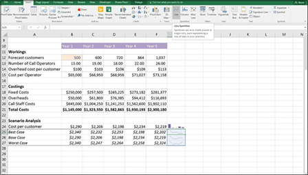 FIGURE 9-5:
Sparklines.

 When deciding which chart to choose, highlight the data, and select Recom- mended Charts from the Charts section of the Insert tab on the Ribbon, as shown in Figure 9-6. This feature was introduced in Excel 2013, and it helps to visualize the data.
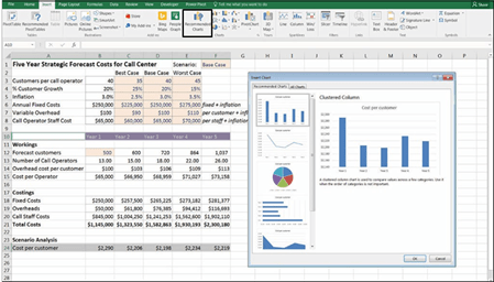 FIGURE 9-6:
Recommended
Charts.
Line charts are most appropriate for indicating trends. Like column charts, the simplicity of line charts makes them one of the favorites in displaying data. Column and line charts can be used interchangeably to display the same data, but line charts
are normally used when there is a connection between the points on the x-axis, such as times or dates on a continuum. Line charts are best used for trending infor- mation such as time series, and columns are better for showing comparisons.
In Excel, you also have stacked line and 100-percent stacked line chart options. Sometimes line charts convey information in a more meaningful manner when the data points are marked.
To build a line chart, such as the one shown in Figure 9-7, highlight the data, and simply select the first 2-D Line option from the Charts section of the Insert tab on the Ribbon, as shown in Figure 9-7.

 The easiest way to add the labels on the x-axis in the chart in Figure 9-7 is to include the data in row 10 when creating the chart in the first place. To highlight data in nonconsecutive ranges, hold down the Ctrl key while highlighting with the mouse.
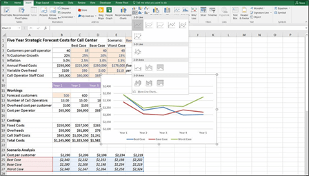 FIGURE 9-7:
Creating a line chart.
Move the chart across so that it isn’t obscuring the data behind it, and add a label.
Take a closer look at the chart you just built. It looks attractive, but which scenario is shown by which line? Grasping the meaning is difficult, particularly if you’re looking at the chart in black and white! Take a moment to put yourself in the viewer’s shoes and see if your message is unambiguously clear. Not really, is it? By putting the legend at the bottom — even if the colors are showing — it’s really difficult to figure out which line is which, so the viewer’s eyes need to go back- ward and forward trying to understand the meaning.
Instead of using a legend at the bottom, let’s put the series names next to each line so that the chart will be easier to interpret. To do this, follow these steps:
- Right-click one of the lines with the mouse.
-
Select Add Data Labels and then Add Data Labels again, as shown in Figure 9-8.
The data values appear. Don’t worry — we’re going to change that.
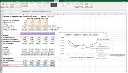 FIGURE 9-8:
Adding data labels to the line chart.
-
Click the label on the far right-hand side (the one with the value $2,324).
Make sure that’s the only one that’s been selected; otherwise, it won’t work properly.
-
Right-click the label, and select Format Data Label, as shown in Figure 9-9.
Note that it must say Label (singular), not Labels (plural), because that would mean the entire series has been selected, which isn’t what you want to do.
-
In the Format Data Label panel on the right side of the screen, check the Series Name box, and uncheck the Value and Show Leader Lines boxes.
The label “Worst Case” now appears next to the fi line.
-
Click the rest of the data labels containing numbers on the line, and
delete them one by one.
-
Repeat steps 1 through 6 with the Base Case and Best Case lines on the chart until each of the lines has its scenario label next to it, as shown in Figure 9-10.
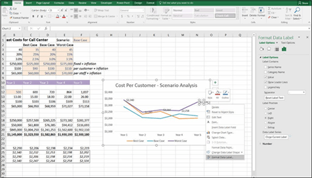 FIGURE 9-9:
Formatting the
data label.
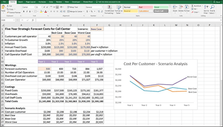 FIGURE 9-10:
Completed line chart with series name labels
-
Adjust the chart sizing as necessary, and move the labels so that each is
next to the correct line.
Don’t mix them up!
-
Remove the legend at the bottom of the chart and remove the gridlines if
you wish by clicking them and pressing Delete.

 Lining up the labels by hand is quite tricky. If you don’t get them aligned properly, it can look messy. Try holding down the Alt key when you move the label — this will “snap to grid,” which helps with alignment. Note that this method works with other objects such as whole charts, shapes, and images and in other programs, too.
Bar or column charts are one of the most commonly used chart types available in Excel, second only to perhaps the line chart in their use in financial modeling. Bar charts are most useful for comparing unrelated data points graphically. They’re very clear and easy to understand. When shown vertically, bar charts are some- times called column charts. Horizontal bar charts represent exactly the same information as column charts from a different perspective. Most commonly, bar charts are used to represent time or future projections along the x-axis.
To build a simple bar chart with only one series, highlight the data, and simply select the first 2-D Column option from the Charts section of the Insert tab on the Ribbon.
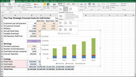
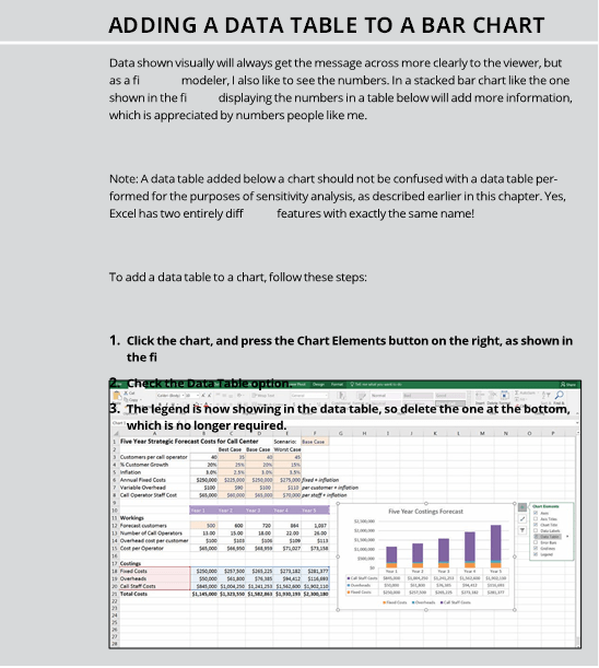
To build a stacked bar chart, highlight all the data, including the series names and the years, as shown in Figure 9-11 (remember to hold down the Ctrl key to select nonconsecutive ranges), and select the stacked column (the second 2-D Column option) from the Charts section of the Insert tab on the Ribbon. Edit the title.
FIGURE 9-11:
Building a stacked
bar chart.

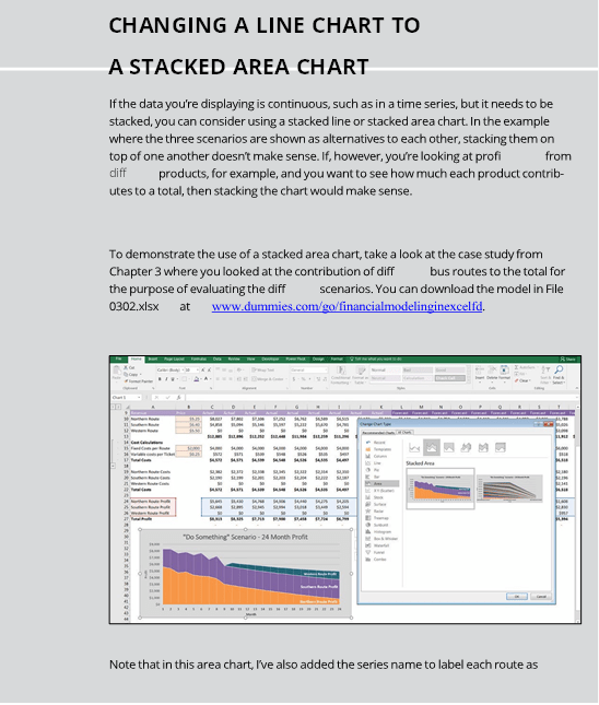
 You may have noticed that there isn’t a lot of difference in terms of the design between a stacked bar chart and a stacked area chart (see the “Changing a line chart to a stacked area chart” sidebar). Which option you choose is a matter of personal preference. Play around with your chart, trying a number of different chart types to see which shows the data best.
 Some data visualization specialists advise against the use of a stacked column chart because it makes the top columns difficult to compare because the bases don’t start at the same value. I like to see the total amount as well as the breakdown, so although I appreciate that it can sometimes make comparison difficult, I still use
stacked bar charts quite a lot when displaying the output of my financial models. You can try using a clustered column, such as the one shown in Figure 9-27, instead — that facilitates a better comparison. But with too many series, clustered columns can quickly become cluttered.
One of my favorite ways of showing different metrics in a single chart is to use a combination of bar and line chart types, which Excel calls a combo chart. I like combo charts because they can convey a lot of information without cluttering the chart. When you want to display as much information as possible in a small amount of space without making the graphic seem cluttered, combo charts are the answer.
You can also show correlations and make a point about cause and effect in your financial model simply and effectively with combo charts. For example, in the chart shown in Figure 9-12, the number of customers is increasing steadily, whereas the cost per customer changes erratically, making the point that just because demand increases, the cost per customer does not see any economies of scale as a result.
The combo chart does not appear on the Ribbon, so to build a combo chart, follow these steps:
-
Highlight the data, including the series titles (by holding down the Ctrl key to highlight nonconsecutive ranges) and select Recommended Chart from the Charts section of the Insert tab on the Ribbon.
The Insert Chart dialog box appears.
-
Click the All Charts tab.
- Click the Combo icon at the bottom, and select the Clustered Column – Line on Secondary Axis option, as shown in Figure 9-12.
-
Select the Cost per Customer Secondary Axis check box, as shown in Figure 9-12.
Its data will now appear on the secondary axis on the right side of the chart.
-
Click OK.
-
Edit the colors and the chart title.
If you want to change the cost per customer to show on the primary axis (on the left instead of the right), select the Forecast Customers check box instead of the Cost per Customer check box in the dialog box shown in Figure 9-12.
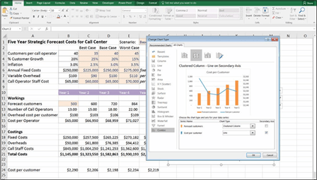 FIGURE 9-12:
Building a combo chart.
 When you create the combo chart, the secondary y-axis (on the right-hand side) has automatically defaulted to starting at $2,140. This makes the difference between the years more noticeable, but it can be misleading so you might decide to change the axis to start at zero instead. To do this, double-click the numbers in the secondary axis (or right-click and select Format Axis) and when the Format Axis panel appears, change the Minimum bounds from 2410 to 0, as shown in Figure 9-13. Compare this to Figure 9-12. You can see that the chart has less impact when the axis starts at zero.
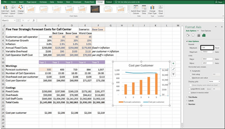 FIGURE 9-13:
Changing the
-
xis to start
at zero.

 Try not to clutter the chart by adding too many series and, as always, look at the chart from your viewers’ perspective and make sure your message is explicitly clear and understandable. In this example, it’s fairly clear which axis contains which value because the secondary axis is formatted with dollars. But to make it even clearer, you might consider adding axis titles, which you can find under chart elements.
Pie charts have also been vilified in recent years because they make it even more difficult than stacked bar charts to compare data. Comparing the sizes of the dif- ferent “slices” of the pie is extremely difficult. Pie charts aren’t useful for com- parison, or for time series. Particularly for dashboards where size is an issue, pie charts take up a lot of space without conveying much information. Pie charts are good, however, for displaying ratios or percentage information, such as market share or penetration. Pie charts are visually appealing, and I tend to use them when comparing only a few categories, such as male versus female.
To build a pie chart, highlight the data, including the series titles and simply select the first 2-D Pie option from the Charts section of the Insert tab on the Rib- bon, as shown in Figure 9-14.
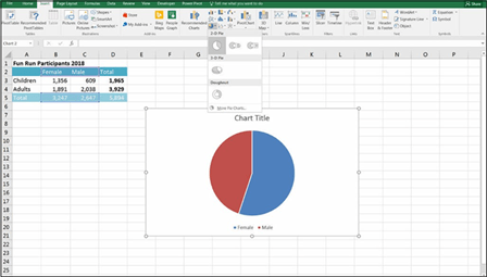 FIGURE 9-14:
Building a pie chart.
Edit the title, and you’re done! Well, not quite. Take a closer look at the chart. Is it really clear which slice is male and which slice is female? Female is shown on the right, and male is on the left, but the data labels are the other way around. This happens sometimes in Excel, and it’s not technically incorrect, but leaving the labels like this make it much more difficult for someone to interpret the meaning of your data. Readers need to look very carefully to see which slice is which.

 Take time to check the outputs of the financial model, especially charts to make sure that the meaning and the message you want to get across can be easily inter- preted by others.
You can edit this chart so that it’s easier to read and can be viewed properly in black and white by following these steps:
- Click the chart, and click the Chart Elements button on the right, as shown in Figure 9-15.
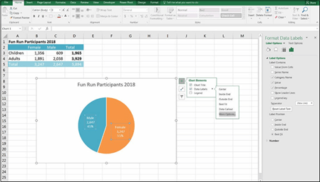 FIGURE 9-15:
Adding data
labels to the pie
chart.
-
Check the Data Labels option.
The value of each category appears on the pie chart.
-
Hover the mouse over the Data Labels option again, and click the arrow
that appears to the right.
-
Select More Options.
The Format Data Labels panel appears at the right.
- Check the Category Name, Value, and Percentage check boxes.
-
Change the Separator to “(New Line).”
Each of the labels is put on a separate line.
-
The legend is no longer required, so delete the one at the bottom, and
add a chart title.