Conveying Your Message by Charting Scenarios
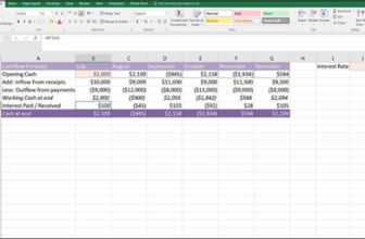
As I mention in Chapter 8, the major limitation of drop-down scenarios such as the one built in the preceding section is that you can’t see multiple scenarios side- by-side. The outputs of the five-year forecast model shown in Figure 9-2 only show the cost per customer under the base case scenario. To show the cost per customer under different scenarios, you need to change the scenario drop-down box in cell F1 — but you’ll only be able to look at one scenario at a time.
To add a data table that will allow you to see the cost per customer of all three scenarios side by side, follow these steps:
-
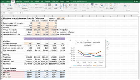
 Add the three scenario names — “Best Case,” “Base Case,” and “Worst Case” — below the Cost per Customer, as shown in Figure 9-3.
Make sure that you spell the names correctly, and don’t add trailing spaces or the data table won’t work.
- Select cells C2:E2 and press Ctrl+C.
- Select cell A25, right-click, and select Paste Special ➪
Transpose to paste the names in cells A25:A17 with exactly the same spelling. - Highlight cells A24:F27 as shown in Figure 9-3.
-
On the Data tab of the Ribbon, in the Forecast group, select Data Table under the What-If Analysis button to display the Data Table dialog box, as shown in Figure 9-3.
Because the variable you’re changing is arranged in column A, you need to tell the Data Table dialog box where the original input is for the column, which is the Scenario cell in F1.
- Under the Column input cell fi select cell F1, as shown in Figure 9-3.

 You can only show one output in a data table, so you chose to show the cost per customer only. If you want to show other values, you need to create additional data tables.
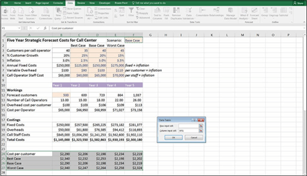 FIGURE 9-3:
Completing the
data table.
Now that you have the scenario results, they can be displayed in a line chart, as shown in Figure 9-4. For instructions on how to build this chart, see the “Line charts” section, later in this chapter.
FIGURE 9-4:
Completed scenario analysis
with chart.
The key message from this model can be seen in this chart. You can see that the cost per customer varies depending on the scenario, and the best case scenario doesn’t necessarily mean that you’ll experience a lower cost per customer.

 Because the data table needs to be arranged in a single block, you can’t insert a row above the scenario outputs to show that these are the results of the scenario analysis. You can change the formatting of row 24 and add the title “Scenario Analysis” in row 23 for clarity, as shown in Figure 9-4.