Charting and Presenting Model Output

ready for the decision makers to use. If you don’t present the outputs of the model clearly, however, the users won’t be able to understand what the model is show- ing, so they might not use it or, even worse, they might use it and misinterpret what the model is saying.
A well-designed report or presentation is the best way to display the model results clearly and concisely and get its message across. The output and presentation of the results are just as important as the rest of the model-building process. There’s no point in having a beautifully designed, fantastically built model that none of the decision makers know (or care) about!
In this chapter, I walk you through conveying your model’s output to an audience to ensure all your modeling efforts are put to good use.

Deciding Which Data to Display
The output of your financial model may be very detailed and contain a myriad of numbers, colors, and confusing calculations. A common mistake is to try to put as much information as possible into one chart in an attempt to make it look impres- sive. In reality, the chart just looks cluttered and fails to get the message across.

 Charts are built for the purpose of presenting information that is easier to digest visually than the raw data. Sometimes two charts may be easier for your audience to digest than one chart. For some tips on designing the output layout and using colors, see Chapter 3.
 If you’re not sure what data will look like visually, you can highlight it and press F11 to display an “instant chart” on a new tab.
 Creating a summary sheet with visuals will help the viewer make sense of the financial model, but deciding which data to display is difficult. Your decision of what to show will depend on a couple of factors:
 » What is your key message? Sometimes the reason that you built the
fi model in the fi place is to convey a particular message to the
audience — for example, “Supply costs are escalating. We need to increase pricing or risk eroding profi In this example, you would show the supply cost per unit over time, versus the price over time, highlighting the key message for the decision maker.
» What is your audience interested in? Sometimes you’ve built a model for a particular purpose, but you know that the audience is particularly interested
in a certain cost or ratio, so this is what you need to highlight in your output report.
Let’s look at the example shown in Chapter 8, where you create a five-year strat- egy for a call center with three scenarios. You can download File 0901.xlsx at www.dummies.com/go/financialmodelinginexcelfd
and select the tab labeled 9-1 to see the model shown in Figure 9-1.
The model calculates the costings for the next five years under different drop- down scenarios. To create a summary of the model’s output, you have to decide which data to display. If you know that the audience is only interested in the cost- ings section, you can create a chart based on the costings data at the bottom of the page, as shown in Figure 9-1. For instructions on how to build this chart, see the “Bar charts” section, later in this chapter.
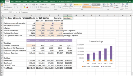 FIGURE 9-1:
Completed five-year model with costings
chart.
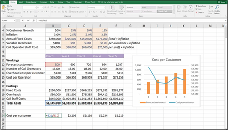
This case study is based on a simplified version of a model I built for a real-life client of mine. I know that the client was actually interested in the cost to serve each customer — finding this out was one of the purposes of building this model in the first place. So, add the cost per customer in row 24 with the formula =B21/B12 and copy it across the row.
The chart shows the cost per customer, as well as the forecast number of custom- ers, so you can see that although the number of customers increases steadily, the cost per customer fluctuates over the five-year period, as shown in Figure 9-2. For instructions on how to build this chart, see the “Combo charts” section, later in this chapter.
FIGURE 9-2:
Completed five-year model with cost per customer chart.
You can see in this case study that deciding which data to display can depend on what the message of the model is, as well as what the audience is interested in.