CHANGING A PIE CHART TO A DOUGHNUT CHART
Doughnut charts are another way of displaying exactly the same information as a pie chart. To change your pie chart to a doughnut chart, follow these steps:
- Right-click the chart and select Change Chart Type.
-
Select the Doughnut Chart option, which is on the far right of the Pie section,
and click OK.
The data labels don’t look right, so play with some of the settings.
- To change the size of the hole in the middle of the Doughnut, right-click the chart series and select Format Data Series, as shown in the fi
-
Reduce the hole size to around 30%.
The Doughnut hole size can be found in the Format Data Series panel on the right.
- Reposition the data labels if necessary.

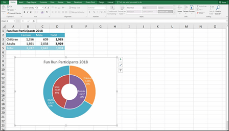 FIGURE 9-16:
A stacked doughnut chart (not
recommended).
Charts in newer versions of Excel
The major change between Excel 2013 and Excel 2016 is the introduction of a number of new charts. With the increased popularity of data visualization and graphic display, Microsoft has kept up with competing business intelligence and data analysis software by making it easier to create popular chart types in Excel. For more information about competing software and changes in Modern Excel, see Chapter 2.
 As with most new features of Excel, the new charts aren’t backward compatible. If, for example, you create a Sunburst in Excel 2016, and someone tries to open it in Excel 2013, the chart will simply show as a blank area. So, make sure that your users have the same version of Excel as you do if you’re planning to include newer Excel features such as these charts in your model.
Waterfall charts
Waterfall charts are very useful for displaying the output of financial models because they pull apart the pieces of a stacked chart and show their incremental effect side by side.
Take a look at the example shown in Figure 9-17. Showing an expense breakdown in a pie chart is not very helpful. Too many series are shown, and it’s very diffi to compare each section without the help of the percentages shown in the data labels.
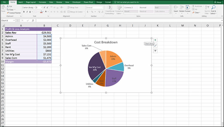 FIGURE 9-17:
A pie chart showing costs (not
recommended).
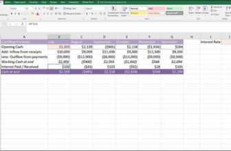
This data is much better shown using a waterfall chart. Not only will you be able to see each of the cost categories side-by-side, but you’ll be able to view the rev- enue amount and the margin as well for comparison. Download File 0901.xlsx from www.dummies.com/go/financialmodelinginexcelfd. Open it and select the tab labeled 9-18 or open a new workbook and enter the data as shown in Figure 9-18.
To build a waterfall chart, follow these steps:
-
Highlight all the data, including the labels and the margin, and select the Waterfall option from the Charts section of the Insert tab on the Ribbon, as shown in Figure 9-18.
-
Edit the title and change the colors.
-
Change the labels on the x-axis so that they’re orientated horizontally.
Showing labels at an angle makes the chart far more diffi to read. You may need to change the size of the chart to do this.
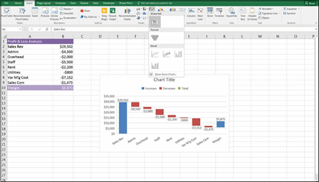 FIGURE 9-18:
Building a waterfall chart.
-
Remove the legend at the top.
Everything you need to know from this chart is shown in the labels already.
-
Set the margin amount as the total so that it shows the remainder only, as it does in Figure 9-19, by clicking the bar showing the margin, right- clicking, and selecting the option Set as Total.
This moves the margin column down so that it shows correctly against the
x-axis, as shown in Figure 9-19.
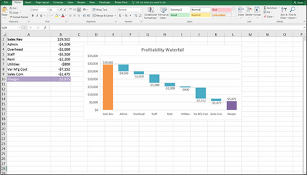 FIGURE 9-19:
A waterfall chart.

 This waterfall chart won’t appear if the fi is opened in Excel 2013 or earlier. For instructions on how to build a waterfall chart using a “dummy stack” or up/down bars that can be opened and used in any version of Excel, go to www.plumsolutions.
com.au/waterfalls.
Sunburst charts
The stacked doughnut chart shown earlier in this chapter doesn’t display gender and age data very well. If you have a hierarchical relationship within your data, you can use a hierarchical chart such as a Sunburst or Treemap.
To build a Sunburst chart, follow these steps:
- If necessary, reorganize your data so that it sits within hierarchical categories, as shown in fi 9-20.
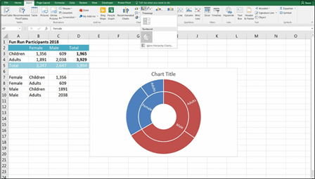 FIGURE 9-20:
Building a Sunburst chart.
-
Highlight all the data, and select the Sunburst option from the Charts
section of the Insert tab on the Ribbon.
- Edit the title and change the colors.
- Add the colors and edit the data labels, as shown in Figure 9-21.
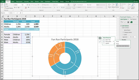 FIGURE 9-21:
A completed Sunburst chart.
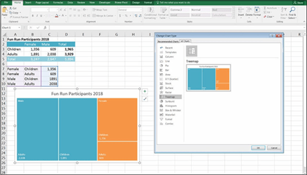
Treemap charts
A Treemap chart works in exactly the same way as the Sunburst, except that the segments are shown as squares instead of circles. The easiest way to change to a Treemap without having to change your settings again is to right-click the Sun- burst, select Change Chart Type, and select the Treemap option, as shown in Figure 9-22.
FIGURE 9-22:
A Treemap chart.

 Although the Sunburst and Treemap show exactly the same data, be sure to try out both types to see which looks best with your data. In this example, the Sunburst looks better visually. If you had a larger number of series, however, the Treemap would probably be easier to understand.