Preparing a Presentation
You know your financial model best. No one is more qualified than you are to talk about your model, so you may be asked to communicate the results of the financial model as a formal presentation to the board or senior management. You need to decide how to communicate your findings in a clear and concise way. Understand- ably, many detail-orientated modelers find that distilling their 20MB financial models that have taken weeks to build into a ten-minute presentation is difficult!

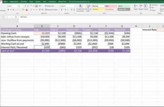
In this kind of environment where you need to convey lots of information, having the summary tables or charts on a PowerPoint slide behind you while you’re speaking will be helpful. It can also help to take the focus off you if you’re a little bit nervous.
Your audience is probably not interested in seeing the workings of the model (and I don’t recommend showing those inner workings unless they’ve specifically requested it), but they might like to see live and changing scenarios. If the model is built correctly, you’ll be able to make a single change to the input assumptions, and the audience will be able to see the effects of these changing scenarios in real time.
 Make sure that you test all possible inputs in advance. Having a #REF! error dur- ing a live sensitivity analysis is a real confidence and credibility killer.
Whether you’re presenting in Excel or using PowerPoint slides, be sure to follow these basic rules of making financial presentations:
» Only display one key message at a time. Don’t crowd the screen with too much detail or try to convey too much at once.
» Use white space instead of gridlines. Gridlines create clutter and the less like a boring Excel spreadsheet your presentation looks, the better. You might love Excel, but many people in the audience will switch off when they see the
gridlines, so make it look more like a presentation and less like Excel.
Show only a high-level summary on the screen.
» Give them a more detailed report to look through after the presentation.
» Make sure the font is big enough and clear on the projector. Test it in advance if you can. Sometimes colors look washed out, making text diffi to read when projected.
» If you’re showing the model itself on the screen, increase the zoom in Excel so that your audience can see the numbers. Test this in advance, and remember that you’ll only be able to show a small portion of the screen
in this way.
» Don’t jump around in Excel. Your audience isn’t as familiar with the model as you are. They’ll need some time to digest what they’re seeing.
» Use charts and graphics to display your message instead of text and numbers.

 Be prepared for questions regarding the output, inputs, assumptions, or workings of the model. Make sure that you can defend the assumptions you’ve used or the way you’ve calculated something. The model output is only as good as the assump- tions that have gone into it, so you need to make sure that the audience accepts the key assumptions in order for them to accept the model results.