Designing How the Problem’s Answer Will Look
When you’ve identified the problem that needs to be solved, it’s very tempting to dive straight in and begin the model-building process, but it’s a good idea to stop for a moment to plan the model and determine how the output will look. When it comes to building a financial model, you want to start with the end in mind.
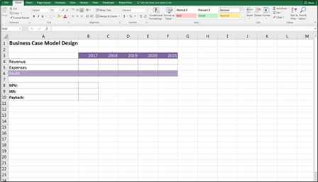
Start by creating a mockup design of the output page. You can do this in Excel, or by simply sketching it on a whiteboard or paper. It can be difficult to visualize what the output will look like until you have the data in it. Modelers aren’t often the most artistic types, but you should have at least some idea of the elements that need to be on the output page.
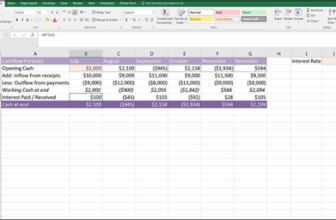
For example, for a business case, let’s say you want to show the net present value (NPV), internal rate of return (IRR), and payback period. To do this, you need cash flow, so the key elements will be revenue and expenses, from which you can derive profitability, and then the NPV, IRR, and payback. You could flesh out the outputs page something like the design shown in Figure 3-4.
Initial design of business case output page.
Then, having completed the financial model, you decide to include some scenario analysis, as well as the customer numbers. The final output page ends up as shown in Figure 3-5. For more information about displaying data visually, see Chapter 9.
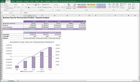 FIGURE 3-5:
Completed business case output page.

 When you have the numbers in the model, you should try to include at least one chart. If you’re not sure how the data will look visually, you can highlight a range of numbers, go to the Insert tab of the Ribbon, and in the Charts section, press the Recommended Charts button. This gives you a preview of what the data will look like displayed in the chart.
Often, the output of a financial model will be in the form of a dashboard, which is a great way of displaying a lot of information clearly and concisely. Building dash- boards in Excel has become so popular in recent years that I run dedicated training courses on dashboard reporting, which are particularly popular with financial modelers who need to display the output of their financial models. Figure 3-6 shows a sample output of a financial model such as the financial statements model built in Chapter 10. You can download a sample copy of this model in File 0303.xlsx at www.dummies.com/go/financialmodelinginexcelfd.
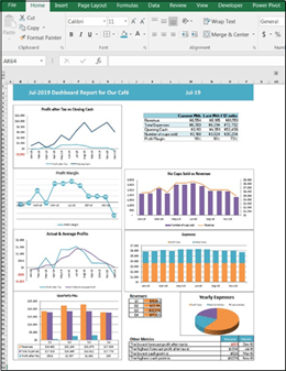 FIGURE 3-6:
Dashboard output of a financial model.
 Here are some tips for designing a dashboard to display the output of your financial model:
 » Don’t overwhelm your users with numbers on a dashboard. Wherever possible, show visuals and charts instead of numbers. Use data labels or a data table (as shown in the lower-left corner of Figure 3-6) if you want to show
numbers on a chart.
» Use contrasting techniques, such as color, bold, and shading to highlight key points. But don’t rely on color alone to show your message, because models are often printed in black and white.
» Align objects so they line up tidily.
» Make sure the model fi neatly onto one page. That way, people can easily print it and refer to it (without needing a magnifying glass).
» Apply the “golden triangle.” Your key message or the most important information should be placed in the upper-left corner — this is where readers will look fi
» Put some eff into the color scheme. Excel randomly allocates standard colors (usually red and blue) to charts, but you should change the colors to match your model theme or company colors to add professional “polish” to
your model.
» Avoid the traffi light combination of red, yellow, and green. The
diff between red and green isn’t obvious to those who are color blind.
(That’s around 8 percent of the male population!)
» Use icon sets. To apply them, highlight some numerical data and choose one of the sets of icons, such as ticks, crosses, or fl which appear when you click on Icon Sets under Conditional Formatting from the Styles section of the
Ribbon. This will automatically add extra meaning to your dashboard without relying on color.
» Make sure the color you use has meaning. The colors should not be reused inconsistently. For example, if revenue is blue in one chart, the same blue should not then be used for expenses on another chart.
» Use color sparingly. Many legacy models I come across in my consultancy work have very bright rainbow colors, which (aside from blinding the user) make it diffi to focus on the key components of the model. Using some
color to make your model appealing is a good idea, but stick to a single color that matches your company logo (or your mood) and use diff shades of the same color unless you want something to stand out signifi tly.
 Some companies have standard color coding, but if your company doesn’t, you might consider developing a standard. Consider including a color code key on the cover page. The use of predefi styles found on the Home tab can make color coding very quick and easy. Many companies have their predefi color coding loaded as style templates, which ensures consistency in color coding in
fi models. Here are some commonly used color codes that are supported by the built-in styles in Excel that you may consider adopting in your company:
- Blue font and beige background for input cells
- Pink or gray for error check
- Green or orange for external links

 To match the logo of your company, fi out the RGB color code and use this code to apply the exact same colors to your model’s headings, totals, or charts. Considering that millions of diff colors are available in Excel, it’s almost impossible to pick the correct one by eye.