Macro 83: Color Chart Series to Match Source Cell Colors
When you create a dashboard, you may have specific color schemes for various types of data. For
example, you may want the North region to always appear in a certain color, or you may want certain
products to have a trademark color. This gives your dashboards a familiarity and consistency that
makes it easier for your audience to consume.
The macro in this section allows the series in your charts to automatically adopt colors in their source
range. The idea is that you can color code the cells in the source range, and then fire this macro to
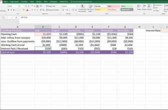
force the chart to apply the same colors to each respective chart series. Although it’s in black and
white, Figure 7-2 gives you an idea of how it works.

Figure 7-2: Using this macro automatically formats the chart series to match the source cells.
How it works
All charts have a SeriesCollection object that holds the various data series. In this macro, we
loop through all the series, bringing each one into focus one at a time. With the series in focus, we
can use any of its many properties to manipulate it.
In this case, we are setting the color to the color of the source range. We identify the source range for
each series by evaluating its series formula. The series formula contains the range address of the
source data. Passing that address to a range object, we can capture the exact color of cells, and then
use that to color the series.
‘Step 1: Declare your variables
Dim oChart As Chart
Dim MySeries As Series
Dim FormulaSplit As Variant
Dim SourceRangeColor As Long
‘Step 2: Point to the active chart
On Error Resume Next
Set oChart = ActiveChart
‘Step 3: Exit no chart has been selected
If oChart Is Nothing Then
MsgBox “You must select a chart first.”
Exit Sub
End If
‘Step 4: Loop through the chart series
For Each MySeries In oChart.SeriesCollection
‘Step 5: Get Source Data Range for the target series
FormulaSplit = Split(MySeries.Formula, “,”)(2)
‘Step 6: Capture the color in the first cell
SourceRangeColor = Range(FormulaSplit).Item(1).Interior.Color
‘Step 7: Apply Coloring
On Error Resume Next
MySeries.Format.Line.ForeColor.RGB = SourceRangeColor
MySeries.Format.Line.BackColor.RGB = SourceRangeColor
MySeries.Format.Fill.ForeColor.RGB = SourceRangeColor
If Not MySeries.MarkerStyle = xlMarkerStyleNone Then
MySeries.MarkerBackgroundColor = SourceRangeColor
MySeries.MarkerForegroundColor = SourceRangeColor
End If
‘Step 8: Move to the next series
Next MySeries
End Sub
1. Step 1 declares four variables. We use oChart as the memory container for our chart,
MySeries as a memory container for each series in our chart, FormulaSplit to capture
and store the source data range, and SourceRangeColor to capture and store the color
index for the source range.
2. This macro is designed so that we infer the target chart based on the chart selection. In other
words, a chart must be selected for this macro to run. The assumption is that we will want to
perform the macro action on the chart we clicked on.
In Step 2, we set the oChart variable to the ActiveChart. If a chart is not selected, an error is
thrown. This is why we use the On Error Resume Next statement. This tells Excel to
continue with the macro if there is an error.
3. Step 3 checks to see whether the oChart variable is filled with a chart object. If the oChart
variable is set to Nothing, no chart was selected before running the macro. If this is the
case, we tell the user in a message box, and then we exit the procedure.
4. Step 4 uses the For…Each statement to start looping through the series in the active charts
SeriesCollection.
5. Every chart series has a series formula. The series formula contains references back to the
spreadsheet, pointing to the cells used to create it. A typical series formula looks something
like this:
=SERIES(Sheet1!$F$6,Sheet1!$D$7:$D$10,Sheet1!$F$7:$F$10,2)
Note that there are three distinct ranges in the formula. The first range points to the series
name, the second range points to the series data labels, and the third range points to the
series data values.
Step 5 uses the Split function to parse this formula in order to extract out the range for the
series data values.
6. Step 6 captures the color index of the first cell (item) in the source data range. We assume
that the first cell will be formatted the same as the rest of the range.
7. After we have the color index, we can apply the color to the various series properties.
8. In the last step, we loop back around to get the next series. After we have gone through all the
data series in the chart, the macro ends.
How to use it
The best place to store this macro is in your Personal Macro Workbook. This way, the macro is always
available to you. The Personal Macro Workbook is loaded whenever you start Excel. In the VBE Project
window, it will be named personal.xlsb.
1. Activate the Visual Basic Editor by pressing ALT+F11.
2. Right-click personal.xlb in the Project window.
3. Choose Insert➜Module.
4. Type or paste the code into the newly created module.
If you don’t see personal.xlb in your project window, it means it doesn’t exist yet. You’ll have to
record a macro, using Personal Macro Workbook as the destination.
To record the macro in your Personal Macro Workbook, select the Personal Macro Workbook option
in the Record Macro dialog box before you start recording. This option is in the Store Macro In drop-
down list box. Simply record a couple of cell clicks and then stop recording. You can discard the
recorded macro and replace it with this one.