Creating dashboards
Dashboards are a visual way to represent data from worksheets in a dynamic format. In this topic, we will look at a few ways to make your data interactive. We’ll proceed as follows:
- As we are building an interactive dashboard after we have created the PivotTable reports, we will create one more report. Click back to the WINESALES worksheet, then choose Insert | PivotTable to create a new report on a new worksheet. Rename the worksheet Date Sold. Add Cases Sold and Years to build the PivotTable report, as illustrated in the following screenshot:
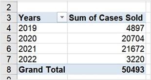
Figure 11.42 – PivotTable report result
-
We are now ready to create PivotCharts for each of the PivotTable reports for the dashboard. We learned this skill we learned in our previous-edition book, Learn Microsoft Office 2019, so we will not recap the chart creation here.
-
Once you have created PivotCharts, copy each PivotChart and position it onto the SSG Dashboard worksheet. You will need to position, align, and resize the
PivotCharts according to your requirements. Use your creative side to apply design colors of your choice.
- Here is an example of our complete SSG Dashboard worksheet showing the four PivotCharts. We will recap by adding a timeline and slicers in another topic to complete the dashboard:
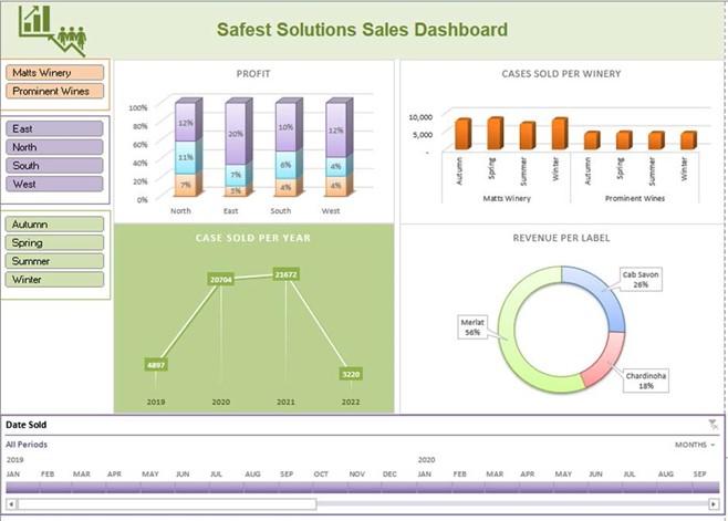
Figure 11.43 – Complete SSG dashboard
- Before we look at slicers and timelines, we need to perform a few tasks so that the dashboard looks more professional.
-
Visit the View tab to customize the Show options so that the Gridlines and Headings
options are removed from the workbook, as illustrated in the following screenshot:
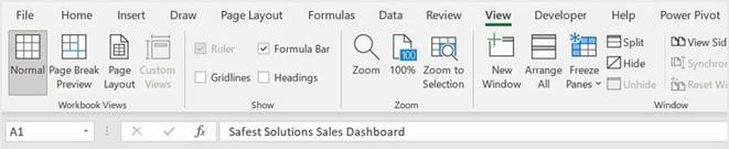
Figure 11.44 – Gridlines and Headings options
We are now ready to customize the dashboard a little more so that it becomes dynamic and not static.
Using slicers and timelines
Using slicers and timelines is an excellent way of filtering data in a PivotTable. The difference between filtering and using slicers is that slicers are more visually appealing and also allow you to quickly retrieve data or update data. We can add slicers to PivotTables, as well as to data formatted as a table. Proceed as follows:
- Click on the Profit PivotChart on the SSG Dashboard worksheet to select it.
- Visit the PivotChart Analyze tab and click on Insert Slicer under the Filter group, as illustrated in the following screenshot:
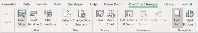
Figure 11.45 – PivotChart Analyze tab to display the Insert Slicer option
- Select fields to add to the dashboard. For this example, we will add Region, Winery, Label, and Season. Click on OK to add slicers.
- The slicers are placed over the PivotCharts.
- Click and drag each slicer to another location to position it neatly on the worksheet. Resize the slicers and align them, if required.
- As we do not need the slicer headings, they can be removed from the slicers. Right- click on a slicer, then select Slicer Settings, which will take you to the screen shown here. Uncheck the Display header option. Click on OK to confirm. Repeat these steps for each slicer on the worksheet:
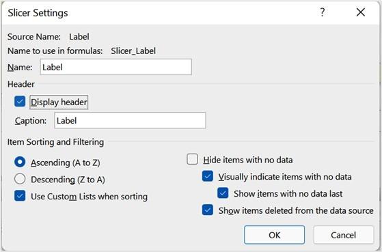
Figure 11.46 – Display header option
-
Slicers can be customized just the same as any other Excel element. Navigate to the
Slicer tab to access Slicer Styles (see Figure 11.47 in the next topic).
Now, we will look at the timeline feature.
Inserting a timeline
The timeline feature only works with date and time values and in tandem with the PivotTable tool. Timelines are not available to apply to a regular table dataset in a worksheet. Timelines are used to interactively filter dates. They operate in exactly the same way as slicers. Here’s how to insert a timeline:
- Click on the Profit PivotChart on the SSG Dashboard worksheet to select it. The workbook you are working on is named MattsWinery.xlsx.
- Navigate to the PivotChart Analyze tab on the ribbon.
- Choose Insert Timeline from the Filter group.
- As we only have one date field in our dataset, select the Date Sold field from the list.
- The timeline is placed over the PivotTable and can be moved by dragging the title bar to a new location on the worksheet.
- To filter the dates, simply click on the drop-down arrow to the right of the timeline to change YEARS to MONTHS, as illustrated in the following screenshot:
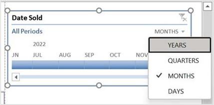
Figure 11.47 – Timeline filter
- Resize and position the timeline on the dashboard, and change Timeline Styles by visiting the Timeline tab.
-
Select items along the timeline to filter the PivotTable data and see the visuals change across the PivotCharts.
Now that we have learned how to create slicers and timelines, let’s customize them so that they are updating all PivotCharts on the dashboard worksheet.
Setting up report connections
- After adding slicers and timelines to a dashboard, you will notice that they only service the PivotChart you selected in order to add the slicer initially. You need to create dynamic report connections to all worksheet PivotCharts so that they all update at the same time, depending on the filter chosen in the slicer or timeline.
- Using the same worksheet (SSG Dashboard) as the previous section, select a slicer by clicking on it.
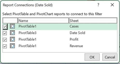
- Right-click on the slicer, then choose Report Connections or go to Slicer | Report Connections, as illustrated in the following screenshot:
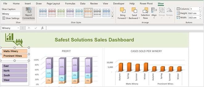
Figure 11.48 – Report Connections button on the Slicer tab
- Ensure that all four connections are selected in the dialog box related to each sheet of the workbook so that the data updates visually as you filter using the slicer. Note that we can rename PivotTables from the default name given when creating them so that you are able to associate the PivotTable name with the required filter. This is especially important if you are developing or preparing report connections with
colleagues. Once set up, it will make more sense to individuals working with you on the data. The Report Connections dialog box is shown in the following screenshot:
Figure 11.49 – Report Connections dialog box
- Click the OK button to confirm.
- Repeat this process for each slicer and timeline on the worksheet.
- The SSG dashboard looks great, and filters are now updating all the data on the PivotCharts. We can customize the entire design in one single click if we are needing to find, or create, a color scheme with our brand colors. Let’s see how this is achieved in the next section.