Aligning and grouping objects
The alignment and grouping tools are valuable skills to master in PowerPoint 2021 as they will objects to be arranged proportionately and duplicated quickly on slides. These skills were covered in detail in the first edition of this book, Learn Microsoft Office 2019. See the Arranging and manipulating objects section in the Chapter 6, Formatting Slides, Charts, and Graphics Elements chapter for more details. In addition to these skills, PowerPoint also has built-in snap features, which will be evident to you when you’re dragging objects around the slide. Lines will appear to indicate whether the object is lining up with the slide or other objects on the slide.
To access the alignment options, select the objects to align, then go to Shape Format |
Align Middle:
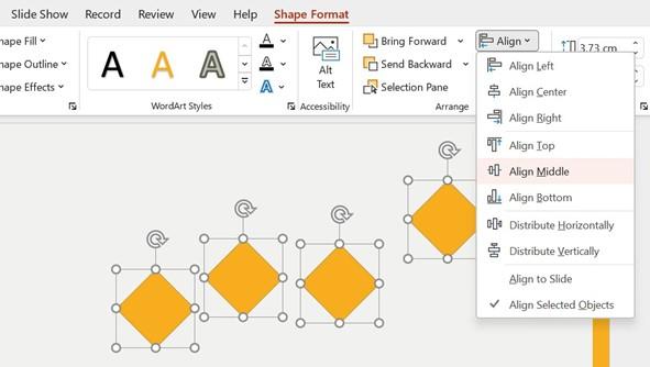
Figure 8.18 – Aligning shapes on a slide
The elements will be lined up neatly on the slide.
Look at the objects we just aligned. The spacing between the objects isn’t equal, especially the difference between the last object and the three before that. To fix this, simply select the objects and click on the Align drop-down list. Then, choose Distribute Horizontally. Now, the objects are all equally spaced on the slide.
Next, we will revisit grouping. Working with grouped objects on a slide saves you an enormous amount of time as you can drag the objects as one unit to another location on the slide. This also allows you to resize the elements as a group and not individually. To use the Group feature, click to select objects on a slide, then right-click and choose the Group option, then Group again:
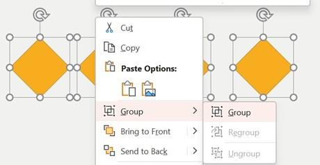
Figure 8.19 – The Group option
Color is a powerful tool and can influence a person’s decision to purchase a product, as well as change a person’s view about an item. It can also evoke emotion – this is how the brain responds to color. We’ll investigate this in the next section.
Color psychology and the brain
When you are working on something creative, you will either have the natural ability to create stunning designs or you could be terrible at those skills. We are all blessed with
a different skill set in the brain. Adding color to a presentation can have a negative or positive influence on the audience and can either connect or disconnect content. Let’s look at some examples.
Color sense
A neutral, low-contrast background fill that’s been applied to objects on slides is best for slide elements. Try not to use gradients and make sure the text’s color stands out clearly. Adding bright colors to slide elements with a light text font applied could negatively impact the audience:
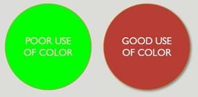
Figure 8.20 – Using color
Take into consideration the color that’s displayed when projecting to an audience – always do a run-through at the venue you will be presenting at, as text and objects could appear differently on the screen. Try not to use low contrast colors, such as pastel colors, when formatting slide text as the audience will see a washed-out effect:

Figure 8.21 – Low-contrast colors versus good use of color
Applying too many accent colors to text could be detrimental. Use no more than two colors and two accent colors:

Figure 8.22 – Working with accent colors
Black and white contrasts can be striking, but you would need to add some depth in color for it to not come across as boring or effortless. Depth can be created by applying a shadow
Let’s learn about how colors affect our brain to evoke emotion:

Figure 8.23 – What emotion does this invoke in you?
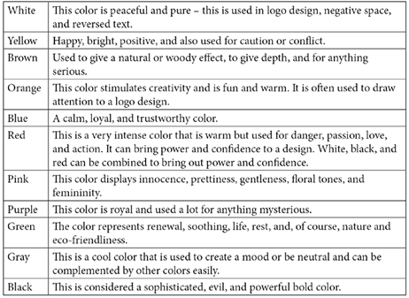
Now, let’s look at how colors evoke emotion:
Table 8.3 – How do colors evoke emotion?
Using exclamation points after text should be done with caution in a presentation as this leads to possibly winning over the audience (a form of propaganda). This will change the audience’s perspective by insinuating how words should make them respond by using an exclamation point to create emotion.