Presentation planning
Planning is crucial to creating a stunning presentation. You should brainstorm by using mind maps (SmartArt or Visio could be useful here), or plan by jotting down points to create an outline of ideas as an introduction, the main body, and the concluding content. After creating the outline, you can think about adding content, then images, captions, and formatting the content. Think about the first slide of the presentation and how you could capture the audience by adding an entertaining image.
The following table shows factors to consider when planning content:
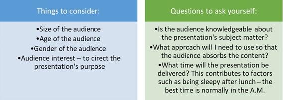
Table 8.1
There are also several things to avoid when creating slide content:
- Create no more than 10 slides in a presentation.
- Your presentation should be no longer than 20 minutes.
- Font size should be no less than 30 pts in size – this is dependent on the design and, of course, sub-points.
- Only add the main points to a slide – this is just the visual aid; the narrative is the important bit. A comprehensive handout can be distributed via an online link after the presentation has been delivered.
Basic design principles
There are several design principles to take into consideration that contribute greatly to the audience’s retention of the information you convey to them. The five most important design principles for presentation design are Balance, Movement, Emphasis, Unity, and White Space:
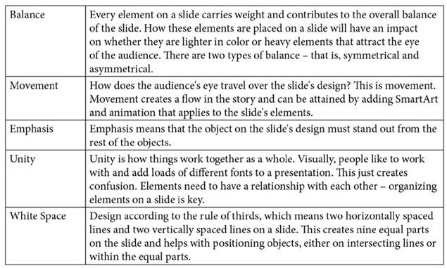
Table 8.2
Symmetrical, which is referred to in the previous table under the Balance section, means that the objects or compilation on a slide are the same on both sides if you draw a line through the middle of the object or design. Asymmetrical is when a design lacks symmetry when its objects do not correspond to each other (in the arrangement of objects, size, or shape) but still maintain balance.
It is important to adjust the visual weight of objects in terms of three elements, as follows:
- Color
- Contrast
- Scale
Taking note of these principles when designing slides will have the benefit of providing an eye-catching, fascinating, and peppy impact. Use tools such as SmartArt to create a flow in the content on a slide.
White space and the rule of thirds
Always take white space on a presentation slide into consideration, and design according to the rule of thirds. Use guides on a slide to create a grid where you can place design elements. White space utilization refers to provisioning minimalism and removing poorly placed objects on slides:
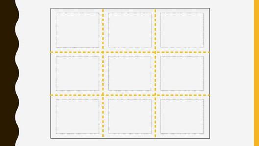
Figure 8.9 – Slide separated by guides using the rule of thirds
Two equally spaced horizontal, and two equally spaced vertical, lines on a slide will divide the slide into nine equal parts where elements can be arranged – this is called the rule of thirds. This photography visual design principle is applied when you’re applying images to slides and learning to maximize the use of white space on the slides. Adding an image or text to the center of a slide does not meet the rule of thirds principle:

Figure 8.10 – Placing an image in the center of a slide does not meet the rule of thirds
The principle is used in many different disciplines, not only in visual design. A power point (not PowerPoint, the application) involves positioning an element at the intersection between a horizontal and vertical guideline point:

Figure 8.11 – Image positioning using the rule of thirds
Now, let’s learn more about communicating to engage audiences.