Modifying charts
We use charts to make information more appealing, as well as clearer and easier to read. As you might have gathered, a chart is a graphical representation of worksheet information. Within Office 2021, the interface is so much clearer and more defined, and elements that you normally would apply to charts manually are included on the ribbon. So, everything is at your fingertips.
Getting used to chart terminology is ever so easy; you simply click on elements to amend them, and the element is highlighted on the chart. Chart terminologies were addressed in our previous book, Learn Microsoft Office 2019, along with chart creation and working with tables, so we will not address them here.
As tab names are a little different in 2021, let’s run through how to add Data labels as an example. The process to modify charts is the same for most elements you add in the new version of Office.
Data labels
To make a chart more understandable and easier to read for the user, we can add data labels. Although a chart layout can be selected using the Chart Styles group within the ribbon, there will be times when you need to add or remove elements from a chart manually. Use the data shown in the following screenshot to construct a Clustered Column chart on a new blank slide in PowerPoint 2021:
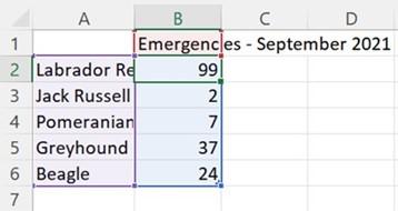
Figure 6.27 – Selected data on the worksheet
To apply data labels to the preceding chart, follow these steps:
- Select the chart by clicking on it.
- From the Chart Elements option (the + icon) on the right-hand side of the chart, select Data Labels. Alternatively, use the Chart Design tab to locate Add Chart Element (the first icon on the ribbon). Then, locate Data Labels from the drop- down list:
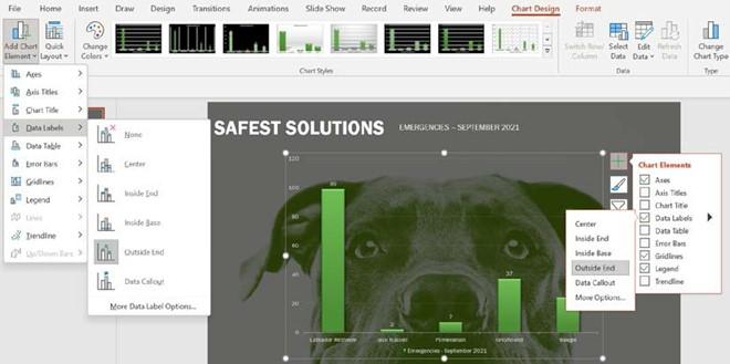
Figure 6.28 – A clustered column chart showing different methods of adding Data Labels
- Once you have selected Data Labels, use the black arrow to open further options to customize the data label. The chart will update immediately.
- Click on one of the data labels on the chart once (this will select all of the data labels). To select just one of the data labels, click again.
- To make formatting changes to the labels, visit the Format tab and apply the formatting options as required.
- Name the chart SSEmergencies.pptx. Let’s use the same steps to add a data table.
Adding a data table
A data table refers to how data is represented according to the worksheet data that was used to create the chart. Once inserted, the data table forms part of the chart so that it is visually more appealing when printed or displayed onscreen. Remember that there are lots of quick layout chart options, including data tables. Follow these steps:
- Select the chart to add data labels.
- Click on the Add Chart Element icon from the Chart Design tab ribbon:
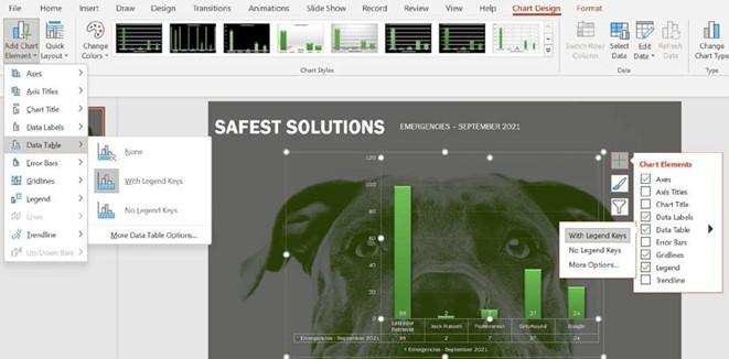
Figure 6.29 – The Data Table option
- Locate Data Table from the list provided. From the drop-down list, choose an option to apply to the chart.
- To add any other elements, such as chart Legend, use the same method as earlier.
Adding objects to a chart
Objects such as images and illustrations (shapes, pictures, icons, WordArt, text, and more) are added to the chart’s background using the Insert tab. There are a couple of new features in Office 2021 under the Stock Images… option. As this feature is referenced throughout this book, we will not go through all the options here. Once inserted, the objects are formatted using the same methods we use to edit in Word or Excel 2021. These elements can also be animated to create focus when presenting them:
- To add an object to the chart, locate the Insert tab from the PowerPoint ribbon. Here, we can select from a variety of choices (the Images, Illustrations, Add-ins, Links, Text, Symbols, and Media groups):

Figure 6.30 – The Insert tab on the ribbon displaying variety of object groups
- Let’s insert the sixth Sticker, using the Stock Images… | Stickers option:
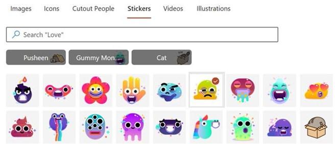
Figure 6.31 – A list of available stickers from the Stock Images option
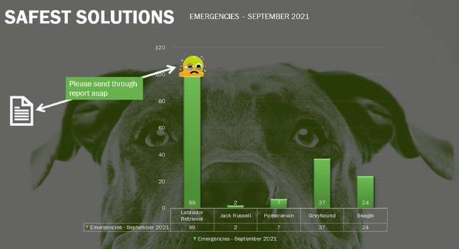
- Click on Insert to add the object to the slide. Then, resize and reposition to the top of the Labrador Retriever column.
- Next, insert a document icon, and amend the Graphics Fill setting to white. Add an arrow shape and format as in the next screenshot. Lastly, add a text box to include the text Please send through report asap. Change the fill color using the Eyedropper tool, picking the color of the column:
Figure 6.32 – The finished chart including the customized objects
- You will need to change the Arrange options so that the textbox displays before the arrow shape.
Now that we have learned how to amend charts in Office 2021, we will revisit Themes in PowerPoint 2021.