LETTERING ON THE DRAWING
Generally all the lettering on the sheet is carried out in capital letters and following points should be kept in mind while carrying out the lettering.
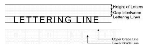
For writing letters, naturally upper and lower guide lines are required sothat all the letters are of equal height and they are arranged in a single row. The guide lines should be thin upto such an extent that these are just visible to the working person; 4H pencil with much lesser pressure may serve the purpose. The spacing between two guide lines should be equal to the height of the letters required. These two guide lines alongwith the space in between becomes a lettering line. A space slightly greater than the height of the letters should be provided between two lettering lines sothat these are reasonably seperated.
After drawing the guide lines, no instrument is to be used for the lettering, the Lines should be drawn freehand and the proportions should be approximately guessed. Letters should be written firm with 'H' or 'HEM' pencil depending upon the natural pressure which one applies on the pencil.
The procedure of writing as given in Fig. 2.9 must be followed without any change.
In the figure, each letter is divided into different strokes and a graph is provided in the
background for providing idea about the proportions of height and width. One stroke means a single fluent line drawn without releasing the pressure on the pencil inbetween. Each stroke is numbered to represent the order of strokes and the same order must be followed while carrying out lettering. Starting and ending points of the strokes are clearly marked by arrows. Always start from the tail and move towards the head. Starting or ending marks should not be placed for any stroke and no stroke should be doubled because, in this way, the line will become a multi-stroke line. If there is any mistake during lettering, erase whole of that. letter and start again.
Fig. 2.8 Guide Lines for Lettering
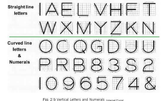
Fig. 2.9 Vertical Letters and Numerals (Internet S°urce)
The proportions between width and height for each letter should be as accurate as possible. The height for each letter is 6 divisions in Fig. 2.9 and the letter may be
assumed to be enlarged or reduced so that its height becomes equal to the spacing of
the guide lines. The width of some letters are 5/6th of the height (five spaces wide),
others occupy a square (six spaces wide), letter 'W' is eight spaces wide and letter 'I° has width just equal to the thickness of the line. In case of I-H-T-L-E-F group, all the strokes should be as vertical and as
horizontal as possible. For N to W group, inclined strokes are also used while in 0-0-
C-0 group, circular strokes are used. For all other letters, irregular curves are to be
used which require muchmore practice because the proportion ofwidth and height is
to maintained at the same time while drawing the line in single stroke.
To write fractions, total fraction height is mate twice the height of the integer. Two extra guide lines ar drawn at a distance equal to half the height of the integer from the top and the bottom guide lines as shown in Fig. 2.10. The numerator is then written first having height about three-fourth the height of the integer and the letter should be
started from the top most guide line. Now horizontal bar is drawn in the center of the
guide line having length equal to the maximum width of the numerator the expected
width of the denominator. Denominator is no written making sure that a clear space is
left above below the horizontal bar. Heights of the numerator and t!- denominator should be made equal to eachother.
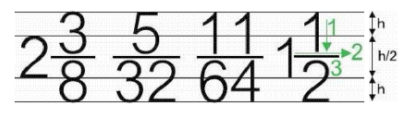
Fig. 2.10 Procedure and Guide Lines for Fractions
Proper spacing of the letters to form words and of words to form sentences is more
important than the shape – the letters themselves for the appearance of a block
lettering. Actual spacing between the letters is not ma constant in a word, instead the
letters are so arranged th approximately equal areas are left between them
producing spacing which is visually uniform. Spacing between two wor. should
approximately be equal to 3 to 4 times the average spacing between the letters in a
word.
To write a line of letters in a given space, height letters is so selected by
experience that all the letters are properly accomodated maintaining thewidth/height rat for the individual letters.