Drill-through
So far, we have seen how we can break down our data using groups, hierarchies, and RLS. Power BI provides another powerful method of breaking down and analyzing data called drill-through. Drill-through is a method that’s used for segmenting data as well as navigating a report. Drill-through allows us to connect pages of reports. A report page can be created that focuses on a particular data entity, such as a division, location, or
employee. Users can then right-click on a data element on one page and drill through to a different page while maintaining the original filter context from the first page.
Using drill-through
Let’s learn how to use drill-through by performing the following steps:
- Start by creating a new page called Page 3. Rename this page Details by double- clicking on the page’s name and then typing Details.
- Now, click on the Utilization page and select the Matrix visualization on the
left-hand side of the page. This is the matrix that has Name in Rows, Category in Columns, and Hours in Values. Use Ctrl + C to copy this visualization. Click back on the Details page and use Ctrl + V to paste this visualization onto the canvas.
- Now, click on Page 2 and copy and paste the Hours by Division and Hours by Location visualizations onto the Details page. Adjust the locations and sizes of these visualizations as necessary. Make sure to shrink the matrix and other visualizations to leave some blank space at the top of the page.
- Click on a blank area of the page’s canvas. Now, expand the People table and select the checkbox for the Location column.
-
Change this visualization to a Card visualization and move this visualization to the top right-hand corner of the page. Adjust the size as necessary. Note that this Card visualization displays our First Location, which is Charlotte alphabetically.
- Click on a blank area of the canvas. Then, in the Visualizations pane, drag and drop the Location column from the People table into the Add drill-through fields here area of the Drill through section of the Visualizations pane. Note that the Drill through section is at the bottom of the Visualizations page:
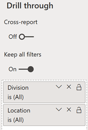
Figure 6.7 – Drill through filters
- Also, drag and drop the Division column from the Hours table as a drill-through field. Note that, in the top left-hand corner of the page, a left-pointing arrow icon will appear, surrounded by a circle, as shown in the following screenshot. This is added automatically to any report page that includes drill-through fields:

Figure 6.8 – Back button
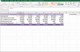
- Click back onto Page 2. In the Hours by Location visualization, right-click the column for Nashville, choose Drill through, and then Details. Note that you are transported to the Details page and that only Nashville appears in the Hours by Location visualization. In addition, Nashville appears in our Card visualization as well. All the visualizations on this page are now being filtered to only show data that’s linked to the Nashville location. You can verify this by hovering over each visual in turn, and then hovering over the funnel icon above or below the visualization to inspect the active filters on each visualization. Also, note that in the Drill through area of the Visualizations pane, Division is set to (All), while Location is set to Nashville.
- Now, hold down the Ctrl key and click on the left arrow icon in the top-left corner of the page. This is a back button. You will be taken back to Page 2. Now, right-click on the Cleveland column in the Hours by Location visualization, choose Drill through, and then Details. This time, only Cleveland information will be displayed on the Details page.
-
Use the back button to go back to Page 2. This time, right-click the 3001 Management column in the Hours by Division visualization, choose Drill through, and then Details. You will be transported to the Details page once more. Note that only the 3001 Management column is displayed in the Hours by
Division visualization. This time, all of the information on the page is being filtered by the 3001 Management division.
Note that the Hours by Location visualization only displays Nashville and Cleveland. This is because the employees that belong to the 3001 Management division only work in Nashville and Cleveland. Why, then, does the Card visualization at the top of the page still say Charlotte? This is because the cross filter direction of the relationship in our model between the People and Hours tables is Single, from People to Hours.
To fix this, we need to do the following:
- Click on the Modeling tab of the ribbon and choose Manage relationships from the Relationships section of the ribbon.
- In the Manage relationships dialog, click anywhere on the From Hours (EmployeeID) To People (ID) relationship except the Active checkbox.
- Now, click the Edit button.
- Change Cross filter direction to Both and then click the OK button.
- Click the Close button to close out of the Manage relationships dialog.
-
After making a brief update to the visualizations, our Card visualization now says
Cleveland since Cleveland is now the first location.
The Data/Drill tab of the ribbon contains a Drill through button in the Data actions section. This tab is activated whenever a visualization contains a hierarchy or can use drill through. Clicking on this button activates the drill-through feature so that clicking on a visualization element will display the Drill through menu.
Buttons
Our use of drill through has exposed another navigational aid within Power BI: buttons. When we added drill-through filters to a page, Power BI automatically created a back button. However, other types of buttons can be used with Power BI. Let’s go over them now.
Types of buttons
To explore the various buttons within Power BI, do the following:
- Create a new page and rename this page Buttons.
- Now, click on the Insert tab of the ribbon. In the Elements section of the ribbon, click on the Buttons icon. There are nine types of buttons in Power BI, as shown in the following screenshot:
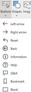
Figure 6.9 – Types of buttons
- Create one of each button type.
- Power BI automatically places buttons in the top left-hand corner of the screen. Move the buttons to a different area of the canvas so that no two buttons overlap.
- Click on each of these buttons in turn. Notice that the Visualizations pane changes to include formatting options for each button and is now titled Format button.
Different buttons have different default formatting options that are either turned on or off by default. For example, the Blank button has the Outline formatting option turned on by default, while the other buttons do not. Most of the options in the Format button
pane are simply options that allow you to change the look and feel of these buttons. One of these formatting options is the Icon option. All of the buttons have this option turned on. If you expand the Icon section, you will see a Shape setting. By clicking on the drop-down arrow for the Shape setting, you will see that a list of icons is presented that mirror the same buttons that can be created, plus an option for Custom. In reality, each of the various button types in Power BI isn’t a button type at all, but rather default settings for a single type of element – a button!
Button states
Th Button Text, Icon, Outline, and Fill formatting options in the Format button pane allow you to display text, an outline around the button, or a filled-in color for the button, respectively. Each of these format settings includes a State setting that can be set to either Default state, On hover, On press, or Disable. Each of these states can be set independently.
To configure these states, do the following:
- Click on the Blank button and toggle the Button Text formatting option on in the
Format button pane.
- Expand the Button Text section. Then, for Default state, type the word Default in the Button Text field.
- Now, change the state to On hover and edit the Button Text field to Hover.
- Finally, change the state to On press and change Button Text to Pressed!.
- Note that the Blank button now contains text that says Default.
- Hover your mouse over the button and note that the button text now says Hover, as shown in the following screenshot:
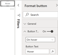
Figure 6.10 – Button states
- Click on the button and note that the button’s text changes to Pressed!.
Button states allow report authors to provide visual cues regarding the outcome of pressing a button.
Button actions
The real magic of buttons rests with their ability to perform actions. The action of a button is controlled by the Action format setting. With the Blank button selected, turn on the Action setting and then expand the Action section of the Format button pane. Under
the Type field, use the down arrow to note the different types of actions shown in the following screenshot:
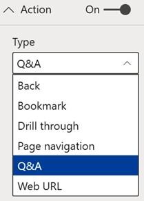
Figure 6.11 – Button states
We have already seen how the Back action works and how it can be useful when we are using features such as drill through. To see how we can use a web URL, do the following:
- Select Web URL.
- A Web URL field will be displayed. Type https://www.powerbi.com into the
Web URL field.
The Drill through action acts exactly like choosing the Drill through button in the Data/ Drill tab of the ribbon. The Page navigation action changes the page of the report. We will explore two other possible actions, Bookmarks and Q&A, in the upcoming sections since these are powerful features of Power BI that can be used with or without the use of buttons.
Note that when using a Type of Drill through, Page navigation, or Web URL for Action, an fx icon appears to the right of the Destination or Web URL setting. Clicking this icon allows the Destination or Web URL setting to be specified by a column in the data model or even a DAX measure.
The same actions that are available for buttons are also available for inserted images and shapes. Images and shapes can be inserted into a report page using the Insert tab of the ribbon in the Elements section. This means that you can use any image or shape just like a button!
Question and answer (Q&A)
Q&A stands for question and answer. It is a powerful tool that has been built into the Power BI Service since its inception. More recently, Q&A has been added to Desktop as well. Q&A allows the user to use natural language to ask questions about the data contained within the data model. The answers that are received are in the form of visualizations.
Best practices for Q&A
There are several best practices to follow to use Q&A effectively.
- First, it is important to start with a good data model that has all of the proper relationships between tables.
- Second, naming tables and columns becomes critical when using Q&A. This is because it uses the words that were typed into the question and tries to match the words with the names of tables and columns within the data model.
- Third, the columns and measures within the data model must be set to the correct Data type. This allows Q&A to return the correct results. For example, if a date column is set to text in the data model, Q&A will return unexpected results when using that date column.
- Fourth, it is important to configure the Summarization and Data category properties of the columns correctly. For example, we set the Year column in our Calendar table to have a default summarization of Don’t summarize. This is because Year is a numeric column but we do not wish to ever aggregate Year. Data categorization is also important as this aids Q&A in choosing the correct visual to return as an answer.
We have followed all of these best practices except for the last one: data categorization. Data categorization is mainly used with geographic columns to denote the type of location element represented by data within the column. Using data categorization to tag these columns provides Power BI with hints regarding the type of information within the column and how it can be displayed. For example, categorizing a column as an Address, City, State or Province, Country, or Postal code provides Power BI with information that it can then use to display this information on a Map visualization. To understand how to use data categorization, follow these steps:
- While in the Report view, expand the People table.
- Select the Location column by clicking anywhere on the name of the column.
- Now, click on the Column tools tab of the ribbon in the Properties section using the drop-down menu next to Data category.
-
Currently, Uncategorized is selected. Change this to City.
Note that a globe icon is now displayed next to our Location column in the Fields pane, denoting that this column represents information that can be displayed on a map. This can be seen in the following screenshot:
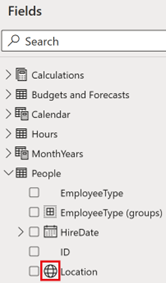
Figure 6.12 – Button states
Now that we have learned about some of the best practices for Q&A, let’s start using Q&A in our report!
Using a Q&A button
Let’s understand how to use a Q&A button:
-
Click back on the Blank button we created earlier, expand the Action section in the
Format button pane, and change its Type to Q&A.
- Hold down the Ctrl key and click the button. The Q&A dialog will be displayed, as shown in the following screenshot:
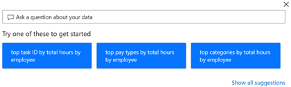
Figure 6.13 – Q&A dialog
Several example questions will be displayed, as well as an entry area that says Ask a question about your data.
- Click inside the Ask a question about your data box and type hours by location. In the area formally occupied by example questions, a map will be displayed, showing bubbles over Cleveland, OH; Nashville, TN; and Charlotte, NC, as shown in the following screenshot:
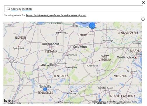
Figure 6.14 – Q&A hours by location
The size of the bubbles on the map denotes the total relative number of hours worked by employees in each location. Note that you can hover your mouse over the bubbles and receive a Tooltip stating the Location and Count of Hours properties. Count of Hours is probably not what was intended. This means that the number is the count of the rows within the Hours table that are related to each location instead of the sum of hours for each location. Further confirmation that this is using a Count of Hours can be found at the top of the map, where it says Showing results for Person location that people are in and number of hours. The exact phase may vary.
To fix this, note that hours and location are underlined where you entered the text hours by location. The underlined words indicate that Power BI has found a table or column name in the model.
- Inside the text box where you entered the question, click on the underlined word hours. Note that there are multiple possible suggestions Q&A provides for data model entities that could refer to the word hours. Under You could also try, click Show more and review the options. None of the options seem quite right, so revise the question to sum of hours by location.
-
Now, hover over one of the bubbles again and note that the tooltip that’s displayed now says Hours instead of Count of Hours and that the numbers are much larger than before. Since the default summarization for the Hours column in the Hours table is set to Sum, we are now getting the sum of the hours by location instead of the count.
- Now, click on location and note that there is an additional suggestion: budgets and forecast location. This is because we have a Location column in both the People table and the Budgets and Forecasts table. Because we have set the data categorization for the Location column in our People table to City, we can remove this ambiguity.
-
Click at the end of the question to place the cursor after location. Remove location and replace it with the word city so that our question now reads hours by city. Note that the same visualization is displayed but that the ambiguity has been removed.
- Click the X in the top-right corner of the Q&A dialog to close the dialog.
The Q&A dialog can be a useful addition to reports as it lets report viewers answer ad hoc questions about the data.
Using Q&A in report authoring
Q&A can also be used for report authoring. To use Q&A in this manner, follow these steps:
- Click on a blank area of the canvas on our Buttons page.
-
Select the Insert tab of the ribbon and from the AI visuals section, choose Q&A.
A blank visualization will appear on the page, along with a similar dialog to what we received previously, stating Ask a question about your data.
-
Type the same question as before; that is, sum of hours by city. Note that the
same Map visualization is displayed and that we have the same underlined words in our question, as shown in the following screenshot:
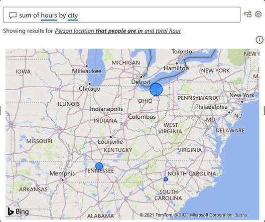
Figure 6.15 – Using Q&A to create visualizations
- Just to the right of the question entry area is two icons. The right-most icon is a gear icon, which allows for advanced configuration of Q&A. When hovering over the other icon, a tip will be displayed that reads Turn this Q&A result into a standard visual. Click this icon. The Q&A dialog will go away and a standard Map visual will be displayed with a title of Hours by Location.
We now have a standard Map visualization that we can resize and move. The Q&A dialog is simply used as a means of creating the visualization. The Q&A feature can also be activated differently by simply double-clicking on a blank area of the canvas. To create a visual this way, do the following:
- Double-click on a blank area of the canvas.
- This time, ask the question sum of hours by city as bar chart. Note that Q&A follows the direction to create the visualization as a bar chart instead of a map visual.
- Add this visual to the report, as we did previously.
We now have a second visualization that we’ve created via Q&A.
Synonyms
Power BI includes another useful feature that can significantly improve the Q&A experience. This feature is called synonyms. With synonyms, the report author can add additional names for tables, columns, and measures that Q&A will then recognize as referring to those data model entities.
For example, continuing with our example from Chapter 2, Planning Projects with Power BI, Pam knows that the three cities the company operates in are internally referred to
as branches. If we double-click on a blank area of the canvas and type sum of hours by branch, Q&A will recognize the word branch but only in the context of people’s names; that is, Rocco Branch, Ellen Branch, and Gabriela Branch. To fix this, do the following:
- Click the gear icon to the right of the question entry box. The Q&A setup dialog will be displayed, as shown in the following screenshot:
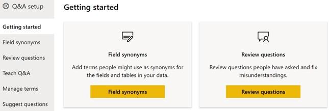
Figure 6.16 – Q&A setup
- On the left-hand side of the dialog, click Field synonyms.
- Expand the People table and scroll down to the Location column.
- Click the Add + button, type the word branch, and then press the Enter key.
- Click the X icon in the top right to close the dialog.
The Q&A visual will update and now contain the same Map visualization as the first Q&A visual we created. Note that the Q&A Setup dialog can be accessed from the Modeling tab of the ribbon while you’re in the Report view. In addition, synonyms can also be added using the Properties pane of the Model view.