Conditional formatting
In addition to the visual cues provided by the gauge and KPI visualizations, Power BI also supports visual cues in the form of conditional formatting. Conditional formatting can be used with tables and matrixes to provide background colors, font colors, and data bars for cells within the visualization. To see how this works, do the following:
- Select the Top Performers visualization.
- In the Values area of the Visualizations pane, right-click % Utilization, choose Conditional formatting, and then Background color. The conditional formatting dialog will be displayed.
- Check the box for Diverging and then click the OK button, as shown in the following screenshot:
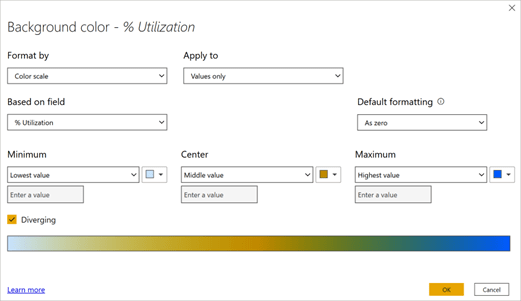
Figure 6.24 – Conditional formatting dialog
- The Top Performers visualization’s % Utilization column is now color-coded based on the highest and lowest values that appear in the column.
Continuing with the example scenario we introduced in Chapter 2, Planning Projects with Power BI, Pam can see how conditional formatting can be useful to create heat maps or otherwise highlight important information, but what she wants is for the % Utilization column to be green if the value is greater than or equal to the Target Utilization Value measure and red if the value is less than the Target Utilization Value measure. To achieve this, do the following:
- Create a new measure in the Calculations table with the following formula:

-
Click back on the Top Performers visual and right-click % Utilization in the Visualizations pane. Then, choose Conditional formatting and then Background color.
- In Format by, choose Rules from the drop-down menu instead of Color scale.
- Change Based on field to our new Meets Goal measure in the Calculations table.
- In the first rule that’s displayed, change is greater than or equal to to is.
- In the next box for the row, ensure that the value is 0.
- Change the next box to the right in the row from Percent to Number.
- To the right, click on the color and choose More colors.
- Replace the value that’s displayed with FF0000 and then click anywhere outside of the color dialog.
- Now, click the + New rule button to add a new rule.
- Change this rule to is, 1, and Number.
- Edit the color to specify a custom color of 00FF00.
-
Now, click the OK button. All of the cells for % Utilization in the Top Performers
visual will now be green.
- Repeat this same conditional formatting for the Worst Performers visualization. All of these cells will now be red.
Conditional formatting has many uses when it comes to highlighting information in information-dense visualizations, such as tables and matrices, and can aid report reviewers in visually identifying important information.
Quick measures
Continuing with the example scenario we introduced in Chapter 2, Planning Projects with Power BI, Pam is feeling pretty good about her new advanced visualizations, but she
suspects that the managers might want to see a running total of all the hours accumulated during the year. However, Pam is uncertain about how to create a running total using DAX. Luckily, Power BI provides a feature called quick measures that can help with much of the DAX heavy lifting. To see how quick measures can be used to create DAX formulas, do the following:
-
While in Report view, in the Fields pane, expand the Hours table, right-click the Hours column, and choose New quick measure. The Quick measures dialog will be displayed, as shown in the following screenshot:
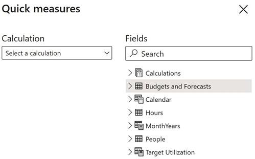
Figure 6.25 – Quick measures dialog
- Under Calculation, use the drop-down menu and note the various types of quick measures that can be created.
- Under the Totals heading, find and select Running total.
-
From the Fields area of the Quick measures dialog, drag and drop the Month column from the Calendar table into the Field area where the Add data fields here text is displayed.
-
Leave Base value as Sum of Hours and Direction as Ascending and click the
OK button.
- A new measure will be created in the Hours table called Hours running total in Month.
- Since Pam wishes to keep all of her measures together in her Calculations table, ensure that the Hours running total in Month measure is selected in the Fields pane and then select the Measure tools tab of the ribbon. In the Properties section, change Home table from Hours to Calculations. The Hours running total in Month measure will now appear under the Calculations table.
-
In Report view on Page 3, create a new visualization by clicking on a blank area of the canvas. Then, select the checkbox for the Hours running total by Month
measure in the Calculations table and the Month column from the Calendar table.
- Switch this visualization from a Clustered column chart to a Line chart. Note that, for months after March, the line remains horizontal since we do not have reported hours for months after March.
Quick measures provide us with an easy way to create dozens of common DAX calculations and can be particularly helpful when we’re beginning to use DAX formulas.
Report tooltip pages
Continuing with the example scenario we introduced in Chapter 2, Planning Projects with Power BI, Pam has heard about another advanced visualization technique that she wants to try to make it easy for managers to gain insight into their utilization numbers. This feature is called report tooltip pages.
Creating a report tooltip page
To create a report tooltip page, follow these steps:
- Start by creating a new page and renaming this page Tooltip1.
- While on this page, click the Format sub-pane within the Visualizations pane.
- Expand Page information and toggle Tooltip from Off to On.
- Next, expand Page size and change Type to Tooltip.
-
Now, select the View tab in the ribbon. Then, in the Scale to fit section, choose
Page view and then Actual size.
- Click on Page 3 and copy and paste the gauge visualization onto the Tooltip1 page.
- Adjust the size and position so that the gauge visualization takes up the top right quadrant of the page. Use the Format sub-pane of the Visualizations pane to toggle Title to Off.
-
Copy and paste the Top Performers visualization from Page 3 onto the Tooltip1
page and adjust the size and position so that it takes up the left-hand side of the page.
-
For the Top Performers visualization, expand the Style section in the Format sub-pane of the Visualizations pane and set Style to Condensed. In addition, expand the Column headers and Values sections and set Text size to 8 pt.
- Create a new visualization positioned underneath the gauge visualization. Make this a Table visualization consisting of the Weekday column from the Calendar table and the % Utilization measure from the Calculations table.
- Use the Format sub-pane of the Visualizations pane to modify this table visualization. Expand the Style section and set Style to Condensed. Also, expand the Total section and toggle Total to Off. Finally, expand the Column headers and Values sections and set Text size to 8 pt.
When finished, your Tooltip1 page should look similar to the following:
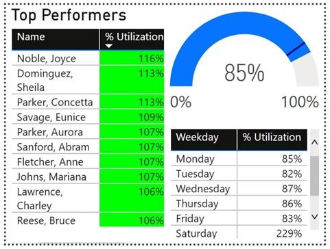
Figure 6.26 – Report tooltip page
Now that we have created our report tooltip page, let’s explore how to use this page in a report.
Using a report tooltip page
To use our new report tooltip page, follow these steps:
- Click back onto the Page 3 page.
- Create a new Table visualization using the Division column from the Hours table and the % Utilization measure from the Calculations table.
-
Select this new table visualization. Then, in the Format sub-pane of the
Visualizations pane, scroll down and toggle Tooltip to On.
- Expand the Tooltip section and ensure that Type is set to Report page. Also, change the Page setting to Tooltip1.
-
Now, use your mouse cursor to mouse over the divisions listed in the Division
column of the table visualization.
Note that the Tooltip1 page is displayed as a popup and filters the information for that particular division!
Key influencers
Pam has heard about one last advanced visualization feature of Power BI that she would like to try. Th s feature adds machine learning functionality to Power BI and is called the key influencers visual. To see this new visual in action, create a new page called Page 4. Find the Key influencers visual in the Visualizations pane and add this visual to the page. Resize this visual so that it takes up the entire page. Drag the Hours column from the Hours table into the Analyze fi ld for this visual. Then, add the following fi lds to the Explain by fi ld:
- Hours > Division (groups)
- Hours > PayType
- People > EmployeeType
- People > Location
The Key influencers visual should now look similar to the following:
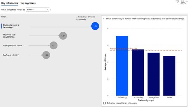
Figure 6.27 – Key influencers visual
Th Key influencers visual packs a tremendous amount of analysis and insight into a small package. On the Key influencers tab, you can see the factors that are most likely to Increase or Decrease the chosen metric, which in this case is Hours. Clicking on the bubbles in the left and pane displays the associated visuals in the right-hand pane. The Top segments tab identifi clusters of values for when the chosen metric is more likely to be High or Low. Th user can click on these bubbles to gain additional insights into these segments.
Summary
In this chapter, we built upon the data model and calculations we created in the previous chapter and learned how to take advantage of the powerful features within Power BI. These features include the ability to segment our data into groups and hierarchies. In addition, we learned how to expand, collapse, and drill up and down through hierarchies, as well as how to use RLS. Next, we learned how additional Power BI features such as drill- through, buttons, Q&A, and bookmarks can be used to provide navigational pathways within reports that viewers can use to unlock self-service business intelligence insights.
Finally, we explored advanced analysis techniques such as Analyze, Summarize, Top-N filtering, gauge visualizations, KPI visualizations, what-if parameters, conditional formatting, quick measures, report tooltip pages, and the advanced key influencers visualization.
These advanced analysis and visualization techniques allow the report author to build truly engaging and insightful reports that provide tremendous value to an organization.
Now that we have learned about all of the necessary techniques, in the next chapter, we will put what we have learned to use by building a final report.
Questions
As an activity, try to answer the following questions on your own:
- What are the two different methods of segmenting data in Power BI?
- What are the four operations for working with hierarchies?
- What feature would a report author use to ensure that people within different roles only see the information that’s relevant to their particular role?
- How is drill-through different than drilling up and down through hierarchies?
- What are the six actions buttons can perform?
- Why is data categorization important for Q&A?
- What are synonyms and where can they be added within Power BI Desktop?
- What is a bookmark and what information can it save as part of its definition?
- What advanced visualization feature allows you to create a measure that can be adjusted by a report viewer?
- What are the three settings that must be adjusted when creating a report tooltip page, and how is a report tooltip page activated for use?
Further reading
For more information about the topics that were covered in this chapter, take a look at the following resources:
- Using grouping and binning in Power BI Desktop: https://docs.microsoft. com/en-us/power-bi/desktop-grouping-and-binning
- RLS with Power BI: https://docs.microsoft.com/en-us/power-bi/ service-admin-rls
- Set up drillthrough in Power BI reports: https://docs.microsoft.com/ en-us/power-bi/desktop-drillthrough
- Create buttons in Power BI reports: https://docs.microsoft.com/en-us/ power-bi/desktop-buttons
- Specify data categories in Power BI Desktop: https://docs.microsoft.com/ en-us/power-bi/desktop-data-categorization
- Best practices to optimize Q&A in Power BI: https://docs.microsoft.com/ en-us/power-bi/desktop-qna-in-reports
- Create report bookmarks in Power BI to share insights and build stories: https:// docs.microsoft.com/en-us/power-bi/desktop-bookmarks
-
Create and use what-if parameters to visualize variables in Power BI Desktop:
Create tooltips based on report pages in Power BI Desktop: https://docs. microsoft.com/en-us/power-bi/desktop-tooltips