Creating Data Models and Calculations
Even though we have loaded in some data, having raw data loaded into separate tables is not enough to enable analysis and visualization. In order to facilitate analysis and visualization, we must create a data model by building relationships between the individual tables, as
well as calculations that will aid us in our analysis. Building a data model with relationships between tables and required calculations allows us to create the necessary reports that will prove useful and insightful to the business. In this chapter, we will learn how to create a data model, create Data Analysis Expressions (DAX) calculated columns, and understand the measures and techniques for troubleshooting DAX calculations.
The following topics will be covered in this chapter:
- Creating a data model
- Creating calculations
- Checking and troubleshooting calculations
Technical requirements
You will need the following in order to successfully complete the instructions provided in this chapter:
- An internet connection
- Microsoft Power BI Desktop
- LearnPowerBI_CH5Start.pbix downloaded from GitHub at https:// github.com/PacktPublishing/Learn-Power-BI-second-edition/
tree/main/Chapter05 - Check out the following video to see the Code in Action: https://bit. ly/3o92RrD
Creating a data model
The concept of a data model or dataset is fundamental to Power BI. In short, a data model is defined by the tables that are created from Power Query queries, the metadata (data about data) regarding the columns within the tables, and finally, the relationships that are defined between tables. Relationships are needed to connect individual tables to one another. In Power BI, the data model is stored within an Analysis Services tabular cube. It is the creation of this data model that enables self-service analytics and reporting.
In Chapter 4, Connecting to and Transforming Data, we connected to various sources of data (three different Excel files) that in turn created seven different queries, which ultimately resulted in four queries that loaded data tables into our data model. We will now stitch those individual tables, along with our previously created data table, into a cohesive data model that can be used for further analysis.
Touring the Model view
So far, we have explored the overall architecture of Power BI Desktop and Power Query Editor. We will now explore the Model view within Power BI Desktop. To switch to the Model view, click the bottom icon in the Views bar of Power BI Desktop.
The Model view is shown in the following screenshot:
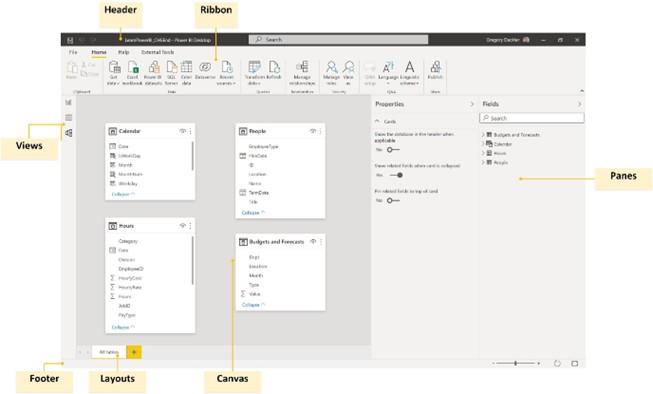
Figure 5.1 – Model view
The Model view provides an interface for building our data model. It does this by creating relationships between tables, as well as defining metadata for tables and columns. We
can even create multiple layouts for our data model. As you might expect, the Model view interface is similar to and shares common elements with Desktop. It is described in further detail here:
- Header: As shown in Figure 5.1, the Header area is identical to what we described in the Touring the Desktop section of Chapter 3, Up and Running with Power BI Desktop.
- Views: The Views area is identical to what we described in the Touring the Desktop
section of Chapter 3, Up and Running with Power BI Desktop.
- Panes: As described in the Touring the Desktop section of Chapter 3, Up and Running with Power BI Desktop, only two panes are present—the omnipresent Fields pane and the Properties pane. The Properties pane is exclusive to the Model view and allows us to associate metadata with various fields or columns within the tables of the data model. This includes the ability to specify synonyms and descriptions, as well as data types, data categories, and default aggregations or summarizations.
- Panes: As described in the Touring the Desktop section of Chapter 3, Up and Running with Power BI Desktop, only two panes are present—the omnipresent Fields pane and the Properties pane. The Properties pane is exclusive to the Model view and allows us to associate metadata with various fields or columns within the tables of the data model. This includes the ability to specify synonyms and descriptions, as well as data types, data categories, and default aggregations or summarizations.
- Canvas: As mentioned in the Touring the Desktop section of Chapter 3, Up and Running with Power BI Desktop, when in the Model view, this area displays layouts of tables within the data model, as well as their relationships to one another. A default All tables layout is created automatically.
-
Layouts: The Pages area from the Report view is replaced by Layouts. The Layouts area allows us to create multiple layouts or views of the data tables within the model, as well as rename and reorder the layout pages.
- Footer: As described in the Touring the Desktop section of Chapter 3, Up and Running with Power BI Desktop, in the Model view, the Footer area provides various viewing controls, such as the ability to zoom in and out, reset the view, and fit the model to the current display area.
- Ribbon: The Ribbon is nearly identical to what we described in the Touring the Desktop section of Chapter 3, Up and Running with Power BI Desktop, with the notable exception that only three tabs are available—that is, File, Home, and Help. If third-party extensions are installed, the External Tools tab is also present.
Modifying the layout
In the Model view, we have a default All tables layout, which was created for us automatically by Power BI.
To modify this layout, follow these steps:
- Minimize the Fields and Properties panes by clicking on the arrow icon in the pane headers (>).
- Click on the tables and drag them closer together. Use the Fit to screen icon in the far right of the Footer to zoom in on the table layout. You should now be able to clearly see the table names and columns in the tables.
- Move the Calendar and People tables next to one another in the top center of the Canvas by clicking on and then dragging and dropping. Place the Budgets and Forecasts and Hours tables underneath these two tables. Use the Fit to screen icon in the footer to zoom in on the tables. Note that we cannot see all of the columns in the Hours table or the Calendar table. A right-hand scroll bar is present on both tables.
- Use the sizing handle in the bottom-right corner of the table to adjust the size so that we can see all of the columns in the table. When finished, your Canvas should look similar to this:
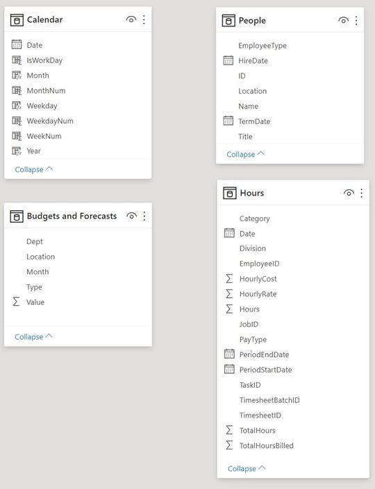
Figure 5.2 – Data tables in the model
Now that we have modifi d the layout such that we can easily see all tables on the screen, let’s continue building our data model by defi g relationships between the individual tables.
Creating and understanding relationships
Now that we can clearly see our tables and columns, we can create relationships between our tables. Creating relationships between tables allows calculations and aggregations to work across tables so that multiple columns can be used from separate, related tables.
For example, once the People table and the Hours table are related to one another, we can use the ID column from the People table and the TotalHoursBilled column from the Hours table. By doing this, TotalHoursBilled will aggregate correctly for each user Identifier (ID) in the People table.
To create this relationship between the People table and the Hours table, perform the following step: click on the ID column in the People table and drag and drop it onto the EmployeeID column in the Hours table. Note that a line appears on the canvas that connects the People table to the Hours table. This creates a relationship between the ID column in the People table and the EmployeeID column in the Hours table.
You can check the columns that are involved in a relationship by hovering your mouse over the relationship line. The line will turn yellow, as well as the columns involved in the relationship. If you notice that ID and EmployeeID are not columns associated with the relationship, hover over the relationship line, right-click it, and choose Delete. Then, try again.
Note that the line has 1 next to the People table and * next to the Hours table. This means that this relationship is one-to-many or many-to-one.
In other words, there are unique row values in the People table that match multiple rows in the Hours table. This makes sense since each employee submits an Hours report for every day. The designation of 1 (unique) or * (many) defines the cardinality of the relationship between the tables.
There are actually four different cardinalities for relationships in Power BI, as outlined here:
- One-to-one: This means that there are unique values in each table.
- Many-to-one: This means that there are unique values in one table that match multiple rows in another table.
- One-to-many: This means that there are unique values in one table that match multiple rows in another table.
- Many-to-many: This means that neither table has unique values for rows. It is generally good practice to avoid these types of relationships because of their complexity and the amount of processing and resources required.
The designation of many-to-one versus one-to-many is simply a matter of which table is defined first within a relationship. In other words, the relationship between our People table and Hours table could be either many-to-one or one-to-many, depending on which table we defined first in our relationship.
Note that there is also an arrow icon in the middle of the line that points from People to Hours. This indicates that the People table filters the Hours table, but not vice versa. This is known as the cross filter direction. Cross filter directions can be either Single or Both, meaning that the filtering occurs only one way or bidirectionally. In simple data models, you generally don’t have to worry about cross filter direction, but it can become very important if the complexity of the data model increases.
Finally, note that the line that forms the relationship between the tables is solid. A solid line indicates an active relationship. Inactive relationships can be created between tables, and these are represented as a dashed line. In Power BI, there can only be a single active path between tables. In other words, there can only be a single path of a relationship cross-filtering from one table to another. This is the active pathway.
As models become more complex, multiple paths from one table to another may be created. In those cases, one of the relationships or pathways will become inactive. However, even though the relationship is inactive by default, it can be used within calculations that specify a specific relationship to use.
We can view and modify the relationship defi tion by double-clicking on the relationship line.
In the following screenshot, we can see the Edit relationship dialog:
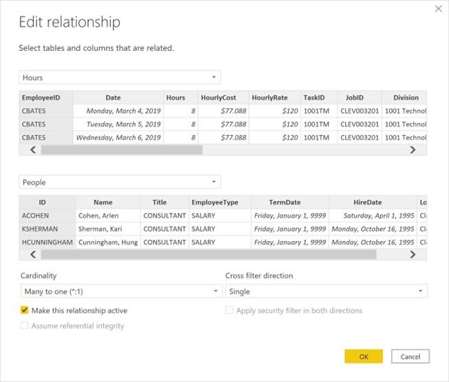
Figure 5.3 – Edit relationship dialog
Note that since the Hours table is defined first and the People table is defined second, the Cardinality value of our relationship is Many to one (*:1). Also, note that the relationship is active and that the Cross filter direction value is Single.
In many-to-one and one-to-many relationships, a Cross filter direction value of Single means that the one side of the relationship filters the many side. Finally, note that the EmployeeID column in the Hours table and the ID column in the People table are highlighted in gray. This shows us the columns that form a relationship between the two tables. Close the Edit relationship dialog by clicking the Cancel button.
Now, let’s create another relationship, this time between our Calendar table and the
Hours table. To do this, we will use the Manage relationships functionality, as follows:
- Click on the Home tab of the ribbon. Then, in the Relationships section, choose the Manage relationships button. The Manage relationships dialog will be displayed, as illustrated in the following screenshot:
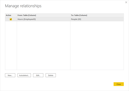
Figure 5.4 – Manage relationships dialog
Here, we can see our existing Active relationship between the Hours table and the
People table, including the columns involved in the relationship in parentheses. From this dialog, we can Edit or Delete the relationship or have Power BI attempt to Autodetect relationships between tables. Power BI can sometimes autodetect relationships between tables based on the column names and row values.
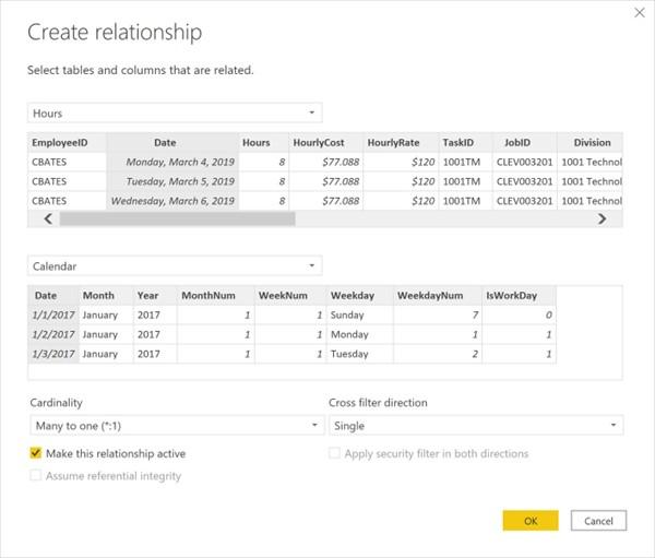
- Select the New button. This displays the Create relationship dialog, as illustrated in the following screenshot:
Figure 5.5 – Create relationship dialog
- In the first drop-down menu, choose the Hours table. A preview of the table will be displayed. Then, click the Date column.
-
Choose Calendar in the second drop-down menu. A preview of this table will be displayed. Choose the Date column from this table. Power BI detects the
appropriate Cardinality and Cross filter direction values. Since there are no other relationships between these tables, Power BI checks the Make this relationship active checkbox.
- Click the OK button to create this relationship. Note that this new relationship now appears in the Manage relationships dialog.
- Click the Close button to close the Manage relationships dialog. In the canvas, there will now be a relationship line linking the Calendar table to the Hours table.
Congratulations—you have successfully linked the three separate tables to create a data model! For now, we won’t link the Budgets and Forecasts table within our data model. Instead, we will start to create visualizations and calculations so that we can analyze our data.
Exploring the data model
Before we move on, let’s do some exploration of our data in order to understand our data, our data model, and how this data will ultimately be viewed by end users, as follows:
- Start by clicking on the Report view in the Views bar.
- At the bottom of the report canvas, click the plus (+) icon next to Page 1. This creates a new blank page, Page 2. Double-click Page 2 and rename it Utilization, and then press the Enter key. This changes the name of the page to Utilization.
- Expand the People table in the Fields pane by clicking the small arrow to the left of the People table. Check the box next to the Name field. This creates a Table visualization on our report canvas with the names of employees. Use the sizing handles for this visualization to resize the table to take up the entire page.
-
Expand the Hours table. Make sure that our table is selected and then check the box next to the Hours field. The number of hours reported by each employee is shown next to their name. This occurs because of the relationship between our People table and our Hours table. Because these tables are joined by a relationship based on the ID of each employee, we can use fields from both tables in the visualizations. Due to this, the rows in the tables are automatically filtered based on this relationship.
Note that when the Table visualization is selected, the Hours and People tables have a small yellow checkmark next to them. This indicates that the visualization contains fields from these tables.
-
We know that the Category field of the hours is important, regardless of whether the hours are billable or not. With the table selected, click on the Matrix visualization in the Visualizations pane. This icon is to the immediate right of the highlighted Table visualization. Note that the Fields pane changes from just
displaying a Values field well to now containing field wells for Rows, Columns, and
Values. Our Name field is now under Rows, while our Hours field is under Values.
- From the Hours table, click on Category and drag and drop this field into the Columns field well. We can now see a breakdown of the hours for each employee by category.
-
It is now obvious that we can calculate a simple version of our utilization metric by taking the number of Billable hours and dividing them by the Total number of hours.