
Generating data
Power BI Desktop is all about connecting to data, modeling that data, and then visualizing that data. Therefore, it makes sense that you cannot really do much within Power BI without data.
So, in order to get started, we are going to create some data to familiarize you with basic operations within the desktop.
Creating a calculated table
First, we will create a calculated table as follows:
- While in Report view, click on the Modeling tab.
- Choose New Table from the Calculations section of the ribbon. The formula bar will appear with the words Table =, and the cursor will become active within the formula bar.
- Type the following formula into the formula bar, replacing the existing text in its entirety:

The preceding and subsequent formulas in this book are created and tested for the English language version of Windows and Power BI Desktop. Different language settings for Windows or Power BI may impact these formulas slightly. To make the formulas as compatible as possible, spaces have been added before commas preceded by numbers to account for cultures that use commas for decimal points. Th s may look a bit odd, but this is the most compatible approach with various cultures.
This formula creates a table named Calendar that has a single column called Date. This table and column will appear in the Fields pane. The CALENDAR function is a DAX function that takes as input a start date and an end date. We used another DAX function, DATE, to specify the start and end dates of our calendar. The DATE function takes a numeric year, month, and day value and returns a date/time data type representative of the numeric inputs provided.
Here is what your screen should look like:

Figure 3.2 – New table creation using the DAX Formula bar
Congratulations! You have just written your first DAX formula!
- Press the Enter key on the keyboard to create a table called Calendar in your data model. Switch to the Data view to observe the table created:

Figure 3.3 – Initial Calendar table with a Date column
Note, in the footer at the bottom, that this table consists of 1,095 rows of data. In fact, this table contains a row for every date inclusive of, and between, January 1, 2017, and
December 31, 2019. If you do not see this information in the footer, make sure to select the table in the Fields pane.
Creating calculated columns
While we are in Data view, let’s add some additional data to our simple, single-table data model:
-
Make sure that the Calendar table is selected in the Fields pane and then click the
Table tools tab in the ribbon.
- Click on New Column in the ribbon and a new column named Column will appear in your table.
- Type this new formula into the formula bar, completely replacing all existing text, and press the Enter key to create the column:
Month = FORMAT([Date],”MMMM”)
Here, we use the FORMAT function to create a friendly month name, such as January instead of 1. Within this formula, we refer to our Date column created previously using the column name prefi ed and suffi ed with square brackets ( [ ] ).
When referring to columns or measures within DAX formulas, these column and measure names must always be surrounded by square brackets. You should now have a new column called Month in your table with values such as January, February, and March for every row in the table.
- Repeat the preceding procedure to create six new columns using the following DAX formulas:
- Year = YEAR([Date])
- MonthNum = MONTH([Date])
- WeekNum = WEEKNUM([Date])
- Weekday = FORMAT([Date],”dddd”)
- WeekdayNum = WEEKDAY([Date],2)
- IsWorkDay = IF([WeekdayNum]<=5 ,1, 0
- Year = YEAR([Date])
You should now have a total of eight columns in your Calendar table:

Figure 3.4 – Calendar table with eight columns
The columns include our original Date column, our text Month column, and the six columns shown in the preceding screenshot. The first five columns—Year, MonthNum, WeekNum, Weekday, and WeekdayNum—all refer to the original Date column and use simple DAX functions that return the year, numeric month, week number of the year, weekday name, and lastly, weekday as a numeric value between 1 for Monday and 7 for Sunday. The last column, IsWorkDay, uses the IF DAX function.
The IF function works identically to Excel’s IF function. The first input parameter is a true/false expression, the second parameter is the result returned if that expression
evaluates to true, and the last parameter is the result if that expression evaluates to false. In this case, we are returning 1 for Monday – Friday, and 0 for Saturday and Sunday.
Formatting columns
Now that we have a single table data model and some columns, let’s take a closer look at what we can do with this data:
- Start by clicking on the Date column and the Column tools tab of the ribbon should automatically activate.
- Change Data type by clicking on the drop-down arrow and select Date. Format automatically changes to Wednesday, March 14, 2001 (dddd, MMMM, d, yyyy) and all of the values for the Date column in the rows of your table are automatically updated to match this format. Note that this could be slightly different depending on your language settings:
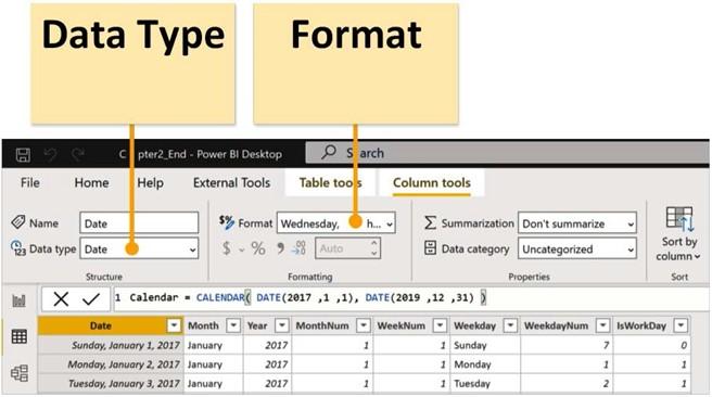
Figure 3.5 – Data Type and Format options in the ribbon of the Column tools tab
-
In the Format dropdown under Date format, select the first listed format,
*3/14/2001 (M/d/yyyy). Note how many different date formats are available! The
Date column in the rows in your table is again updated to match this new format.
- Click on the Month column and note that Data type and Format both read Text. Also, note that the lettering in the table for the Month column is non-italicized and left-justified. This is a visual cue that indicates that this column is text.
- Click on the Year column and note that Data type and Format both read as Whole Number. Observe that the lettering in the table is italicized and right-justified. Again, this is a visual cue that indicates that this column is a number.
- Click the dropdown for Data type and choose Text. While a year is certainly a number, it does not make any sense to sum, average, or otherwise aggregate a year, so we will specify the column as Text.
-
Click on the MonthNum column. In the Properties section of the Column tools tab, note that Summarization is set to Sum. Again, it is unlikely that summing a column of month numbers is going to aid us in our analysis, so set
the Summarization field to Don’t summarize instead. Repeat this process for the
WeekNum and WeekdayNum columns.
Congratulations! You have just built your very fi st data model! Sure, it is an extremely simple data model at the moment, but there are big things in store for this Calendar table in the next chapter when we will add more data tables and relationships.
Before we move on to creating visualizations, however, first save your work by choosing File and then Save in the ribbon. Save your work with the filename LearnPowerBI. The file extension is .pbix. After saving, notice that the Header changes from Untitled to LearnPowerBI.
Now that we have some data, we can start creating some visualizations of our data model.
Creating visualizations
Human beings are visual creatures. In the same way that a picture is worth a thousand words, so too can visualizations of data convey information and insights in a manner that is just not possible otherwise.
Creating your first visualization
Follow these steps to create your first visualization:
- Begin by clicking on the Report view in the Views area.
- In the Fields pane, if your Calendar table is not already expanded so that you can see the column names in the table, simply click the > icon to the left of the table name to expand the table and show the columns.
-
Start by clicking on the IsWorkDay column and drag and drop this column onto the canvas. Instantly, you have a clustered column chart whose y axis goes from
0 to 800. If you hover your mouse over the column, you will see the text IsWorkDay 782 displayed. This popup is called a Tooltip, and this indicates that there are 782 combined working days (Monday-Friday) in the years 2017, 2018, and 2019. Sure, this is a little high because we are not accounting for holidays, but we will get to
that later. Note that in the Visualizations pane, IsWorkDay has been added to the Values field and the text IsWorkDay appears in the upper-left corner of our visual as a title for the visual and also appears as a label on the y axis.
In the following screenshot, we can view our first visualization:
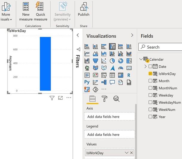
Figure 3.6 – Your first visualization – a simple column chart
Obviously, this is not the world’s greatest visualization, but it is a start!
- Drag the Month column from the Fields pane into this same visualization. Now, our visualization has 12 columns of varying heights, and, in the Visualizations pane, the Month column has been added to the Axis field as well. Also, the visual title now displays IsWorkDay by Month, and Month appears as an x axis label. However, if you are being observant, you will notice that the months are in a seemingly strange order. In fact, the months are currently being sorted by the value of IsWorkDay. Let’s change that.
- Click the ellipsis (…) in the upper-right or lower-right corners of the visual and then choose Sort by followed by Month. Click on the ellipsis again, and this time choose Sort ascending. Hmm, it’s still not quite right. Our visual is sorted by Month now, but our month names are still in the wrong order from what we would expect. This is because the Month column is Text, and therefore the names of the month are being sorted alphabetically instead of what you would expect to be in the order they occur within a year. Not to worry.
- In the Fields pane, click on the Month column. The Column tools tab of the ribbon becomes active. In the ribbon, in the Sort section, click Sort by column and then MonthNum:
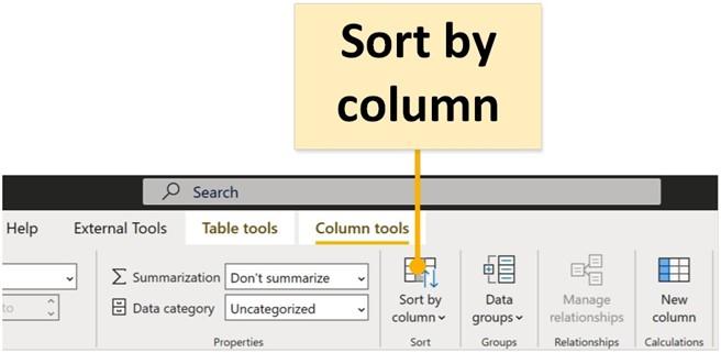
Figure 3.7 – Sort by column
There we go. All fixed! Now, our visual’s x axis lists the month names in the correct order! Your visual should now look similar to the following. The specific values in your y axis may vary:

Figure 3.8 – Correctly sorted column chart by MonthNum
Note that with this visual selected on the canvas, in the Visualizations pane, the fourth icon to the right in the top row is highlighted. This indicates what type of visual is currently displayed. Visualizations can be changed instantly by simply selecting a different visualization icon.
Formatting your visualization
Now that we have a visualization, let’s do some simple formatting, starting with moving and resizing our visual:
- Click the mouse cursor anywhere inside the visual and drag the visual down to the lower-left corner of the canvas.
- Observe the sizing handles on the edges of the visual. Hover the mouse over the upper-right sizing handle and notice that the mouse cursor changes from the standard pointer to two arrows.
- Click this sizing handle and drag it up and to the right. The goal is to resize the visual to consume exactly one-quarter of the screen. Drag your handle until you observe two dotted red lines, one horizontal and one vertical, and then unclick. The dotted red lines are called Smart Guides, and, in this case, they indicate when the canvas has been bisected. You should now have a resized visual that takes up exactly one-quarter of the canvas.
Next, let’s tackle that tiny print in our visualization. Power BI Desktop defaults to a rather small font size. Let’s make this visual easier to read:
-
Ensure that your first visualization is selected in the canvas. You know that the visualization is selected if the visual is outlined and the sizing handles are
displayed. Look at the Visualizations pane. Just under the palette of visualization icons, there are three icons: one that looks like cells in an Excel spreadsheet,
a paint roller, and a magnifying glass. These are the Fields, Format, and Analytics
sub-panes, as shown here:
Figure 3.9 – Visualizations pane – sub-panes for Fields, Format, and Analytics Currently, there is a yellow line under the default Fields sub-pane, indicating that this is the currently selected sub-pane within the Visualizations pane.
- Select the Format icon and note that the yellow line now underlines the paint roller icon. Within this sub-pane are a number of expandable sections.
-
Expand the X axis area and change Text size to 11. Scroll down and expand the Y axis section and again set Text size to 11. Scroll down again, expand the Title section, and set Text size to 16. Just above Text size, select the middle Alignment icon to center our title within our visualization. Note the changes happening to
our visual as you perform these operations. The text size for our x and y axis values increases as well as the size of the text of our title.
- Next, scroll up and modify Title text to read Number of Working Days by Month.
- Scroll up and expand the Data labels section. Notice that everything is grayed out and cannot be modified.
-
Activate this section by using the toggle icon to the right of the Data labels text. Numeric values appear above the columns in our visualization. Increase Text size to
11. Change Position to Inside end. Finally, toggle on Show background.
-
Note that additional settings appear below Show background. Change the
Background color fi ld to the default top orange color and set Transparency to 25%.
Your visual should now look like the following screenshot:
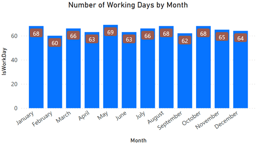
Figure 3.10 – Improved column chart visualization
Now that our visual is formatted, let’s add some simple analytics