Understanding Dashboards, Apps, Goals, and Security
While reports are likely to be what you will interact with the most in the service, there are other aspects of the service that are quite powerful and can add tremendous value. It is important to understand the capabilities of dashboards and apps to determine the best method of sharing and collaborating on your work. In addition, scorecards and goals can help you keep track of important business metrics. Finally, it is imperative that you understand all of the objects within the service in order to ensure that only the proper individuals have access to and can interact with your data. The goal of this chapter is to familiarize you with all of the other objects within the service and understand how these different objects interrelate to one another in terms of security.
The following topics will be covered in this chapter:
- Understanding dashboards
- Creating and using apps
- Working with goals
- Understanding security and permissions
Technical requirements
You will need the following to successfully complete this chapter:
- An internet connection.
- An Office 365 account or Power BI trial.
- If you have skipped any of the previous chapters, you can download LearnPowerBI.pbix from GitHub at https://github.com/ PacktPublishing/Learn-Power-BI-second-edition.
- If you have skipped any of the previous chapters, you can download LearnPowerBI.pbix from GitHub at https://github.com/ PacktPublishing/Learn-Power-BI-second-edition.
- Check out the following video to see the Code in Action: https://bit. ly/3kjTNyZ.
Understanding dashboards
Dashboards are single-page canvases that contain visualizations called tiles. These tiles are visualizations that are pinned from reports, other dashboards, Question and Answer (Q&A) displays, or other sources such as quick insights. Single visuals or entire report pages can be pinned.
At first, you may be confused with regard to the purpose of dashboards versus reports since both are essentially a collection of visualizations. The most important difference is that reports can only contain visuals based upon a single dataset, while Power BI
dashboards can contain visuals from many different reports within the same workspace. In addition, dashboards have exclusive features, such as setting alerts, setting a featured dashboard, control over navigation, and the ability to view real-time data streams.
Because dashboards can contain information from one or more reports and one or more data sources, dashboards allow end users to create a single, customized view of all of the information within an organization that is most important to them.
Creating a dashboard
To create a simple dashboard, we will perform the following steps:
- Make sure that you are viewing a report in the service. Then, click on the Executive Summary report page.
- Hover your mouse over any of the visualizations on the page and note that several icons appear in the upper-left corner of the visualization. The icon second from the left is the Pin visual icon, as shown in the following screenshot:
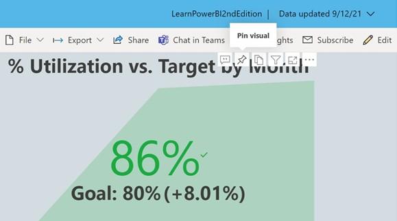
Figure 10.1 – Pin visual icon
- Click the Pin visual icon, which may show up at the top or the bottom of the visual. The Pin to dashboard dialog is displayed, as shown in the following screenshot:
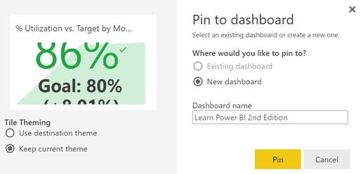
Figure 10.2 – Pin to dashboard dialog
-
Enter Learn Power BI 2nd Edition in the Dashboard name field and then click the
Pin button.
-
The name Learn Power BI 2nd Edition now appears under the Dashboards
sub-heading for the workspace in the Navigation pane. Clicking on this dashboard displays the pinned visualization as a tile on the dashboard.
Now that we have created a simple dashboard, we can explore how to work with dashboards in the service.
Working with dashboards
Working with dashboards in the service is in some ways very similar to working with reports. In this section, we will explore the various options and features of dashboards in the service.
Once a dashboard has been created, the new dashboard appears under the Dashboards
heading in the navigation pane, as shown in the following screenshot:
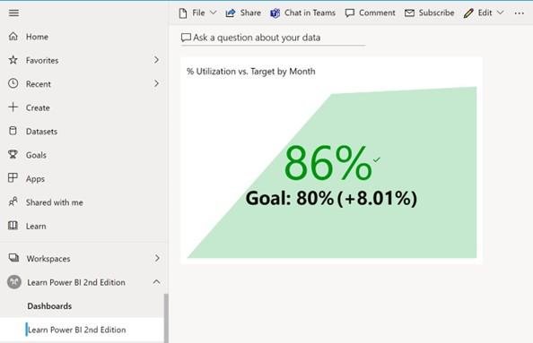
Figure 10.3 – Dashboard interface in the service
Referring to Figure 10.3, viewing dashboards in the service presents a ribbon with various functions, including the following:
- File
- Share
- Chat in Teams
- Comment
- Edit
- Subscribe
- Ellipsis (…)
The Share, Chat in Teams, Comment, and Subscribe options essentially work the same for dashboards as reports, thus we will not explore these options in depth here.
Let’s take a look at the rest of the ribbon features.
The File menu
The File menu contains the following options:
- Save a copy
- Print this page
- Performance inspector
- Settings
Save a copy and Print this page work similarly to the equivalent options under the
File menu for reports. Performance inspector simply reports on network connectivity performance. The Settings menu is again similar to the Settings menu option for reports, except for the Q&A option.
The Q&A toggle
Q&A in the service works similarly to Q&A functionality in the desktop, allowing dashboard users to ask questions about the underlying data and receive answers back in the form of visuals. For dashboards with Q&A enabled, you can access and use Q&A by following these steps:
- Ensure that the Q&A toggle is on in the Settings menu for the dashboard.
- Click the Ask a question about your data text that appears in the upper left of the dashboard canvas. Clicking on this brings up the Q&A interface within the service, as shown in the following screenshot:
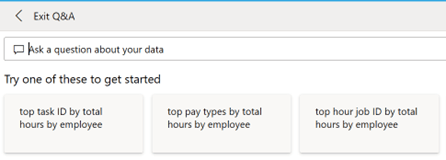
Figure 10.4 – Q&A interface in the service
- Suggested questions are presented to aid the dashboard user in forming acceptable questions. Your suggested questions may be different than those in Figure 10.4.
- Enter your own question, such as total hours by division where category is PTO, in the Ask a question about your data field.
- Enter your own question, such as total hours by division where category is PTO, in the Ask a question about your data field.
- Once you find a visual that you like, click Pin visual in the ribbon area. This displays the Pin to dashboard dialog, as shown in the following screenshot:
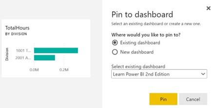
Figure 10.5 – Pin to dashboard dialog
- Click the Pin button to pin the tile to your current, existing dashboard.
- Once you’re back on the Q&A interface, click Exit Q&A in the ribbon to return to your dashboard and see your new tile.
Now that we have explored the File menu, let’s move on to the Edit menu.
Edit
The Edit menu contains the following three options:
- Add a tile
- Dashboard theme
- Mobile layout
Let’s explore these options further.
Add a tile
While tiles can be added from a variety of sources, certain types of tiles can be added directly to the dashboard. These types of tiles are listed here:
- Web content
- Image
- Text box
- Video
- Custom Streaming Data
Choosing Add a tile brings up the Add a tile pane. This pane walks you through creating the desired type of tile. For images and videos, these simply require a Uniform Resource Locator (URL) link to the desired content. For videos, these must be YouTube or Vimeo URLs. Uploading your own images and video isn’t supported. Textboxes simply require you to enter the text that you want to be displayed, along with any desired formatting.
Web content tiles take an embed code, which is generally in the form of an Inline Frame
(IFRAME). Finally, streaming data can be in the form of the following:
- Application Programming Interface (API) (push datasets)
- Azure Stream PubNub
For more information on streaming datasets, see the Further reading section of this chapter.
Dashboard theme
Choosing the Dashboard theme option brings up the Dashboard theme pane, as shown in the following screenshot:
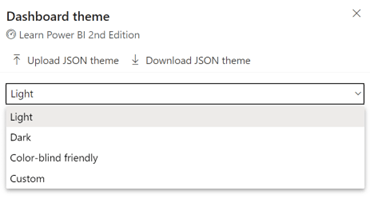
Figure 10.6 – Dashboard theme pane in the service
The drop-down field provides various pre-built themes, including the following:
- Light
- Dark
- Color-blind friendly
- Custom
The Custom option allows you to create a custom theme by selecting colors, tile opacity, and whether or not to use a background image. This theme can be downloaded by clicking on Download JSON theme. Downloading a JavaScript Object Notation (JSON) theme allows you to edit the JSON file in a text editor. This provides additional levels of control over the theme.
For example, the following theme file can be created:
{
“name”:”LearnPowerBI”,
“foreground”:”#FFFFFF”,
“background”:”#EC670F”,
“dataColors”:
[“#EC670F”,”#3C3C3B”,”#E5EAEE”,”#5C85E6″,”#29BCC0″,
“#7EAE40″,”#20B2E7″,”#D3DCE0″,”#FF6B0F”],
“tableAccent”:”#20B2E7″,
“tiles”: {
“background”:”#3C3C3B”,
“color”:”#E5EAEE”,
“opacity”:1.00},
“visualStyles”:
{“*”: {“*”: {“*”:
[
{“color”:
{“solid”:
{“color”:”#E5EAEE”}
}
},
{“labelColor”:
{“solid”:
{“color”:”#E5EAEE”}
}
}
]
}} },
“backgroundImage”:null
}
You can download this theme file, LearnPowerBIDashboardTheme.json, from the following link: https://github.com/PacktPublishing/Learn-Power-BI- second-edition. Once this file has been created or downloaded, follow these steps to implement the theme:
- Use Upload JSON theme to upload the theme file.
- Click the Save button in the dialog to activate this theme.
Your dashboard should now have a color scheme similar to the report used to create your final report.
Mobile layout
As with reports, dashboards can have a custom mobile layout. Choosing this option presents an Edit mobile layout interface similar to the mobile layout when editing reports, allowing you to build a custom view for phones and mobile devices. Tiles can be pinned and unpinned from this interface, as well as resized and moved around the canvas. This phone view is automatically saved once created. To exit the Edit mobile layout interface, choose Mobile layout in the ribbon and then Web layout. To delete the custom mobile layout, click the ellipsis (…) while in Edit mobile layout and then choose Delete mobile layout.
Ellipsis menu
The ellipsis (…) menu provides a number of useful options for dashboards, including the following:
- See related content
- Open lineage view
- Open usage metrics
- Set as featured
All of these options work identically to the same options for reports. Choosing the Set as featured option means that every time that you go to the Power BI service, your landing page is the chosen featured dashboard.
Working with tiles
The size and position of tiles can be adjusted on the dashboard canvas. In addition, tiles provide additional functionality, such as the creation of alerts and overall navigation.
Sizing and position
To reposition a tile, simply click anywhere on the tile and drag the tile to a new location on the canvas. To change the size of a tile, hover over the tile with your mouse and then use the sizing handle that appears in the lower-right corner of the tile. Tiles can be resized to preset tile dimensions. As you resize a tile, these various possible tile dimensions are shown as a gray shadow on the canvas.
Tile options
Options for tiles can be accessed by hovering over a tile and then clicking on the ellipsis (…) in the upper-right corner of the tile. This options menu provides a number of actions, including the following:
- Add a comment
- Chat in Teams
- Copy visual as an image
- Go to report
- Open in focus mode
- Manage alerts
- Export to .csv
- Edit details
- Pin tile
- Delete tile
Most of these options work similarly to information we have already covered for reports and dashboards or need no real explanation. For example, Copy visual as an image does exactly that, simply copying the tile as an image to your copy-and-paste clipboard. However, Manage alerts and Edit details deserve further explanation.
Manage alerts
Only simple numeric tiles such as card tiles and Key Performance Indicator (KPI) tiles have the Manage alerts option. Choosing the Manage alerts option displays the Manage alerts dialog, as shown in the following screenshot:
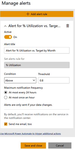
Figure 10.7 – Manage alerts dialog
Use the + Add alert rule button to add a new alert. Alert rules allow you to be automatically notified whenever the metric represented by a tile meets a certain condition, such as falling below a certain value.
Edit details
Choosing the Edit details option displays the Tile details dialog, as shown in the following screenshot:
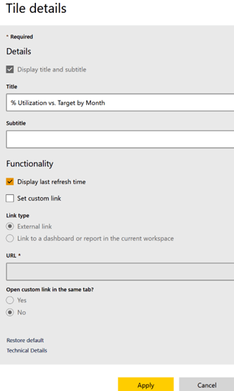
Figure 10.8 – Tile details dialog