Unlocking Insights
Now that we have built and verified our data model, we will explore the many powerful features within Power BI that allow us to break down, analyze, and unlock insights about our data. These features allow the report author to create compelling stories about the data within the data model, guiding report viewers to the most important insights and information.
Unlocking insights is all about creating reports that allow business users to easily navigate a report seamlessly while providing visualizations that make logical sense to the viewer.
This often means that raw data needs to be massaged into groups and hierarchies. In addition, it is important to reduce clutter and only provide data that is relevant to the viewer. Navigational aids allow viewers to seamlessly navigate complex reports intuitively, providing a superior user experience. Finally, advanced analysis techniques are useful for providing a deeper understanding of the data in a visually appealing way that adds to the overall utility of visualizations and reports.
In this chapter, we will cover the following topics:
- Segmenting data
- Using report navigating features
- Advanced analysis techniques
Technical requirements
You will need the following to follow the instructions in this chapter:
- An internet connection.
- Microsoft Power BI Desktop.
- Download LearnPowerBI_CH6Start.pbix from GitHub at https:// github.com/PacktPublishing/Learn-Power-BI-second-edition/
tree/main/Chapter06.
- Download LearnPowerBI_CH6Start.pbix from GitHub at https:// github.com/PacktPublishing/Learn-Power-BI-second-edition/
- Check out the following video to see the Code in Action: https://bit. ly/3C1Adxr
Segmenting data
Power BI provides several mechanisms for segmenting data. These include the ability to use groups, hierarchies, and Row-Level Security (RLS). Segmenting data allows you to partition or group individual rows of data into logical units that make sense to an organization. This helps ensure that business rules are enforced or that metrics can be shown in a manner that is more easily digestible by business users versus looking at individual rows of data.
In this section, we will learn how to create groups that provide business-relevant segmentation of data, as well as logical hierarchies that classify information based on business structures. Finally, we will explore how to automatically filter data so that only the data that’s relevant to the viewer is displayed.
Creating groups
The easiest way to see grouping in Power BI is to use visualizations to summarize data. We can do this by following these steps:
- Create a new page, Page 2, in Power BI Desktop on the Report view.
- While on this page, expand the Calendar table in the Fields pane and select the checkbox for the Month column to create a Table visualization.
- Next, add the Hours column from the Hours table to this visualization.
- Now, change the visual from a Table visual to a Clustered Column Chart visual using the Visualizations pane.
After following these steps, we should have an ad hoc grouping of our hours based on the month in which those hours were reported.
However, there is another way to use groups within Power BI. Instead of using ad hoc grouping, we can define groupings of information as part of the data model itself and then use those defined groups within visualizations.
Refer to the following steps to see how this is done:
- Expand the People table in the Fields pane. Right-click the EmployeeType column and choose New group. The Groups dialog will open. Here, we can define a name for our groups, as well as define the groups themselves. Leave the name of the group as EmployeeType (groups).
- In the Ungrouped values area, select HOURLY, SALARY, and SUB- CONTRACTOR by clicking on HOURLY and then holding down the Ctrl key while clicking on SALARY and SUB-CONTRACTOR. Now, click the Group button. A new group will be created in the Groups and members section. Rename this group Billable.
- Check the Include Other group checkbox and then click the OK button. The Groups dialog is shown in the following screenshot:
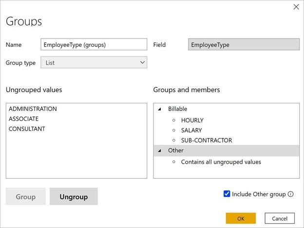
Figure 6.1 – Groups dialog
Note that, within the People table, an entry called EmployeeType (groups) appears underneath our EmployeeType column. This entry’s icon is of a square segmented into four quadrants.
We can use this new collection of groups in visuals by removing the EmployeeType
filter from all the pages.
- Expand the Filters pane, find the EmployeeType filter under Filters on all pages, hover over this filter with the mouse, and click the small x to remove the filter.
- Now, click on a blank area of the canvas and click on the checkbox next to EmployeeType (groups). A Table visualization will be created that contains two rows: Billable and Other. Add the Hours column from the Hours table to this visualization.
Defining groups within the data model is a convenient way to save time by creating reusable groupings of information that can be used within multiple visualizations.