Creating hierarchies
Hierarchies are a powerful feature of Power BI that allows data to be summarized but also allows report viewers to drill down into the data to obtain additional details. Similar to groups, we can create ad hoc hierarchies as well as defi e hierarchies within our data model. The easiest way to see an ad hoc hierarchy is to use a Matrix visualization, as follows:
-
Click on a blank area of the canvas and click the checkbox next to the Location
column in the People table.
-
Switch the visualization from a Table visualization to a Matrix visualization using the Visualizations pane. Some visuals work well with hierarchies, while others do not. Table visualizations are not particularly suited for use with hierarchies, while Matrix visualizations are.
-
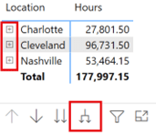
With the matrix selected, drag the Division column from the Hours table into the Rows field well in the Visualizations pane. Make sure that the Division column appears underneath the Location column in the Rows field well. Note that several arrow icons appear above/below our Matrix visualization. In addition, small + icons appear to the left of each row in the matrix. Refer to the following screenshot. If
you do not see the + icons, you can turn them on using the Format sub-pane of the
Visualizations pane by expanding the Row headers section and then toggling the
+/- icons to On.
-
Drag the Hours column from the Hours table into the Values field well of the Matrix visualization. Use the forked arrow icon (see the following screenshot) associated with the Matrix visualization to Expand all down one level in the hierarchy. We can now see the reported hours broken down by Location and Division in our matrix:

Figure 6.2 – Matrix visualization with an ad hoc hierarchy
We can also define hierarchies as part of our data model. However, unlike the previous case, where we created an ad hoc hierarchy from columns in separate tables, hierarchies that are created as part of the data model must have all of the columns in the hierarchy come from the same table.
Follow these steps to create a hierarchy within the data model:
- Expand the Hours table in the Fields pane.
- Right-click the Division column and choose Create hierarchy. A Division Hierarchy element will be created within the Hours table and appear just below our Division column. Note that Division is the first element within our new hierarchy. This can be seen by clicking the > symbol to the left of Division Hierarchy in the Fields pane, as shown in the following screenshot:

Figure 6.3 – Model hierarchy
- Right-click the JobID column, choose Add to hierarchy, and then choose Division Hierarchy. JobID will be added to Division Hierarchy, below Division.
Follow these steps to see our new hierarchy in action:
- Click on the blank area of the canvas and then click the checkbox next to Division Hierarchy in the Hours table.
- Switch the created visual from a Table visualization to a Matrix visualization using the Visualizations pane.
- Add the Hours column from the Hours table to the Values field well.
-
Use the forked arrow icon for this new Matrix visualization to Expand all down one level in the hierarchy. We can now see our hours broken down by Division and JobID.
Defining hierarchies within the data model is a convenient way to save time since these reusable hierarchies of information can be created once and then used within multiple visualizations.
Exploring hierarchies
So far, we have used the forked arrow icon to Expand all down one level in the hierarchy. Now, let’s take a look at the functionality of the other arrow icons:
- In the latest Matrix visualization that we created using our Division Hierarchy, use the up arrow icon to Drill Up within our hierarchy. This collapses our hierarchy to the Division level.
- Switch the visualization to a Clustered column chart using the Visualizations pane.
- Click on the single down arrow icon to turn on Drill down. Note that the down arrow icon is now surrounded by a circle, as shown in the following screenshot:

Figure 6.4 – Drill Mode is on
-
Click on the 3001 Management column to drill down into the hierarchy for just the 3001 Management data. We are now at the JobID level of the hierarchy, just within the 3001 Management leaf of our hierarchy.
- Click on the down arrow icon again to turn off Drill down and then click on the up arrow icon to drill back up to the top level of the hierarchy.
- This time, click on the double down arrow icon. This icon drills down into the second level of the hierarchy across all of the top-level leaves of our hierarchy.
- Use the up arrow icon to drill back up to the top level of the hierarchy.
The same four arrow icons for expanding/collapsing and drilling down and up through a hierarchy, which appear above or below a visualization that contains a hierarchy, are also available in the Drill actions section of the Data/Drill tab of the ribbon. In the Data/ Drill tab of the ribbon, the forked arrow icon corresponds to Expand next level, while the double arrow icon corresponds to Switch to next level.
Understanding RLS
RLS is used to restrict data access for users viewing reports. Roles are created within Power BI Desktop by using DAX expressions to define filters. These filters restrict the data that’s available to that role at the row level of the data. Users are added to roles from within the Power BI Service, but Desktop provides the ability to test role definitions by allowing the report author to view reports as a particular role.
Creating roles
Let’s try to understand RLS by continuing with the example scenario we introduced in Chapter 2, Planning Projects with Power BI. Pam knows that when she creates and publishes the final report, various job functions within the organization will look at the report.
Two of these job functions are branch managers and division managers. Pam wants to ensure that each of these managers only sees the information that pertains to their area of management, without having to create separate reports for each job function and each user within those job functions. Pam can do this by creating roles for each using RLS.
Follow these steps to create the branch manager roles:
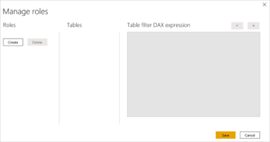
- Click on the Modeling tab of the ribbon and then choose Manage roles from the Security section of the ribbon. The Manage roles dialog is shown in the following screenshot:

Figure 6.5 – Manage roles dialog
- Click the Create button to create a role and name this role All. Since this role should see everything, we will not define a Table filter DAX expression.
- Click the Create button again and name this role Cleveland.
-
With the Cleveland role selected, click on the ellipsis (…) for the People table in the Tables section. Choose Add filter, then [Location]. In the Table filter DAX expression area, the [Location] = “Value” formula will appear.
-
- Replace Value in the formula with Cleveland. When completed, your Table filter DAX expression should be [Location] = “Cleveland”.
- Repeat Steps 3 through 5 to create roles called Nashville and Charlotte with Table filter DAX expression properties of [Location] = “Nashville” and [Location] = “Charlotte”, respectively. These four roles cover the branch managers within the organization, as well as those individuals that need to see all locations.
- Click the Save button to save these roles.
- Repeat Steps 3 through 5 to create roles called Nashville and Charlotte with Table filter DAX expression properties of [Location] = “Nashville” and [Location] = “Charlotte”, respectively. These four roles cover the branch managers within the organization, as well as those individuals that need to see all locations.
Before we create any additional roles, let’s define some additional groups within our data model, as follows:
- While on the Report view, expand the Hours table in the Fields pane.
- Right-click the Division column (not Division Hierarchy) and choose New group.
- Add 1001 Technology to a group called Technology.
- Similarly, add 2001 Accounting to a group called Accounting.
- Add 3001 Management to a group called Management.
- Finally, check the box for Include Other group.
- Click the OK button.
Now, let’s create roles for our division managers by performing these steps:
- Click on Manage roles from the Modeling tab of the ribbon.
- Click Create and call this new role Technology.
- With the Technology role selected, click on the ellipsis (…) for the Hours table, choose Add filter, and then [Division (groups)]. Note that [Division (groups)] appears at the bottom of the list and not under the [Division] column, as it does in the Fields pane.
- Edit the Table filter DAX expression formula so that it reads [Division (groups)] = “Technology”.
-
Repeat Steps 2 through 4 to create roles for the Accounting, Management, and Other Services roles with filter formulas of [Division (groups)]
= “Accounting”, [Division (groups)] = “Management”, and
[Division (groups)] = “Other”, respectively.
- When finished, click the Save button.
We have now created all of the roles we need in our model. Now, let’s test these roles.
Testing roles
It is important to test the roles so that we can be certain that the DAX filters defining the roles operate properly. To see our new roles in action, do the following:
- First, click on a blank area of the canvas and create a Clustered column chart using the Location column in the People table as Axis and the Hours column from the Hours table as Values.
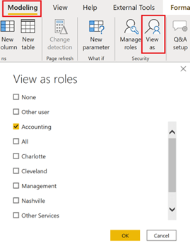
- Now, from the Modeling tab of the ribbon, click on View as in the Security section of the ribbon. Select Accounting and click the OK button, as shown in the following screenshot:

Figure 6.6 – View as roles
- Note that the clustered column chart that displays our Hours using our Division Hierarchy now only displays 2001 Accounting and that our clustered column chart that displays Hours by Location displays all three locations; that is, Cleveland, Charlotte, and Nashville. Note the yellow information bar at the top of our canvas that reads Now viewing as: Accounting. You are now viewing the report using the RLS rules associated with the Accounting role.
-
Click the View as button in the ribbon again, uncheck Accounting, and then view the report as Management, then Technology, and finally by Other Services. Note that, when viewing as Other Services, we see all of our ungrouped divisions.
- Next, test the All group by clicking on View as, unchecking any other roles and checking All, and then clicking on the OK button. Note that we now see all locations and divisions. When we click the Stop viewing button in the information bar, nothing changes.
-
Finally, test each of the location roles in turn and verify that the correct location
– and only the correct location – is displayed in the clustered column chart that summarizes Hours by Location.
- When finished, click the Stop viewing button in the information bar.
RLS is a powerful mechanism for segmenting data that allows a single data model to service multiple different roles within an organization while keeping that data secure.
Now that we have covered various methods of segmenting data, we will look at how to use report navigation features, which help provide a superior user experience by allowing viewers to seamlessly navigate complex reports intuitively.
Using report navigation features
In addition to powerful capabilities related to segmenting data for analysis, Power BI also provides mechanisms for navigating between report pages. This can also be used as an aid for analysis. To this end, we will explore the drill-through functionality, which allows report viewers to easily gain deeper insights from summary data, as well as buttons and bookmarks, which allow viewers to quickly navigate between pages or instantly focus on particular sets of data. Finally, we will explore the Q&A functionality, which empowers report viewers to answer questions about the data contained in reports.

