Advanced analysis techniques
So far, we have seen how we can segment our data using groups and hierarchies, as well as how to use navigational features such as drill-through, Q&A, and bookmarks to uncover and highlight insights into our data. But Power BI still has more to offer with regard to visual features that also allow us to highlight information that is of particular interest or analyze our data in unique ways.
In this section, we will cover a variety of features that enable business users to immediately gain additional detail and insights, including analysis and summarization, Top-N filtering, advanced visualizations, what-if parameters, conditional formatting, quick measures, and report page tooltips. Using these techniques as appropriate can greatly aid in understanding the raw data and unlock meaningful insights that are important to a business.
The Analyze and Summarize features
Power BI provides powerful machine learning and artificial intelligence features that can aid in exploring and analyzing data within a data model. Two of these features are called Analyze and Summarize. To see how these features operate, do the following:
- Create a new page, Page 3, and rename it Analysis.
- Copy the Hours by Location visual from the Details page to the Analysis page. Alternatively, recreate the visual on the Analysis page using a Clustered column chart with the Location column from the People table as Axis and the Hours column from the Hours table as Values.
- Right-click anywhere in the visual, choose Analyze, and then Find where this distribution is different.
- A dialog will be displayed titled Here are the filters that cause the distribution of Hours by Location to change the most, as shown in the following screenshot:
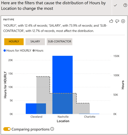
Figure 6.21 – The Analyze feature
The Analyze feature analyzes the data model using automated machine learning algorithms to determine the factors that impact the distribution of data in the visual the most. In the preceding screenshot, we can see that the Nashville location has a high proportion of employees with a pay type of HOURLY compared to Cleveland and Charlotte.
- Use the + icon at the top right of the insight card to add the visual to the current page.
- Scroll down until you find the DIVISION (GROUPS) insight card. Initially, Management is chosen and shows Nashville with a high proportion of Hours for Management.
-
Click the Accounting button to show that Cleveland has a high proportion of
Hours for Accounting.
- Click the + icon to add this insight card as a visualization on the current page.
- Click anywhere not inside the dialog to close the dialog.
In the Hours for HOURLY and Hours by Location visuals, you can hover over the gray dotted line to view the sum of the hours by location. The vertical-colored bars include just the hours for a pay type of HOURLY. The y-axis on the left represents the HOURLY hours, while the y-axis on the right is for the total Hours. We can easily see from this visualization that while Cleveland has the most hours reported in total, the Nashville location has many more hours submitted by HOURLY employees.
By expanding the Visualizations pane, note that the visual is a standard Line and clustered column chart with the Location column from the People table as Shared axis, Hours for HOURLY as Column values, and the Hours column from the Hours table as Line values. While not added to the data model as a measure, Hours for HOURLY is an implicit DAX calculation equivalent to the following formula:

The Analyze feature can be a powerful tool for quickly finding insights about what factors have a big impact on a visualization. Another power tool is the Summarize or Smart narrative feature. To see how this feature operates, perform the following steps:
- On the Analysis page, right-click the Hours by Location visualization and choose Summarize. A text box will appear next to the visualization with a narrative describing the information in natural language. This includes insights around the total number of hours for each location, as well as percentages such as Cleveland accounted for 54.34% of Hours.
-
Select the Hours by Location visualization, expand the Visualizations pane, and this time choose the Smart narrative visual, which, by default, will be in the
right-most column in the fifth row from the top. The Hours by Location visual will change to a text box that contains the same information that was produced by the Summarize feature.
As you can see, the Analyze and Summarize features can help you unlock insights about your data, as well as aid in report authoring.
Top-N filtering
Continuing with the example scenario we introduced in Chapter 2, Planning Projects with Power BI, Pam has been learning a lot about how to segment her data and using navigational features to highlight insights. However, Pam wants to do more to visually show important information. To this end, perform the following steps:
- Create a new page called Page 3.
-
Create a table visualization along the right-hand side of the page using the
Name column from the People table and the % Utilization measure from the Calculations table. This list is very long and Pam knows that managers will mostly be interested in the top and bottom performers. While the list can be sorted by clicking on the % Utilization column in the table, Pam wants to make it easier for managers to focus on the most important information.
- Expand the Filters pane and then expand the Name filter by using the small down arrow icon in the header of the filter. Filter type is currently set to Basic filtering.
- Use the drop-down menu to change Filter type to Top N.
- The Show items field will appear and will be set to Top. In the box next to this, type 10.
-
Next, drag and drop the % Utilization measure from the Calculations table in the
Fields pane into the Add data fields here area underneath By value.
- Now, click Apply filter. The visual will only display the top 10 employees based on their % Utilization.
- In the Visualizations pane, click on the Format sub-pane (paint roller icon).
- Expand the Total section and toggle Totals to Off.
- Scroll down the Format pane and toggle Title to On.
- Expand the Title section and in the Title text area, type Top Performers.
- With the visualization selected, press Ctrl + C to copy the visualization.
- Press Ctrl + V to paste the visualization and drag this new visualization underneath the first visualization.
- Select this new visualization and, in the Filters pane, expand the Name filter and change Show items to Bottom.
- Click Apply filter. Note that more than 10 names are displayed. This is because the bottom performers are all tied at 0%.
- Use the Format pane to edit Title text to Worst Performers.
- Select this new visualization and, in the Filters pane, expand the Name filter and change Show items to Bottom.
Proper use of Top-N filtering allows report viewers to quickly focus on the most important information within visualizations.
Gauges and KPIs
Continuing with the example scenario we introduced in Chapter 2, Planning Projects with Power BI, Pam also knows that the overall utilization compared to a target percentage
of 80% is important. A good way to display a metric concerning a goal is to use a gauge
visualization. To add a gauge visualization to the page, do the following:
- Click on a blank area of the canvas and add a Gauge visualization to the page.
- Add the % Utilization measure from the Calculations table as Value.
- The gauge visualization displays 84.79% on a gauge, ranging from 0.00% to 100.00%.
-
Decimals are not important, so select % Utilization from the Fields pane. Then, on the Measure Tools tab of the ribbon, in the Formatting section, reduce the
decimals that are displayed from 2 to 0. Now, the gauge visual will display 85% on a gauge ranging from 0% to 100%.
- Right-click the Calculations table and choose New measure.
- Create a measure with the % Target Utilization = 0.8 formula.
- Select the % Target Utilization measure. Then, in the Measure tools tab of the ribbon, click the % icon in the Formatting section and set the number of decimal places to 0.
- Select the gauge visual and add the % Target Utilization measure to the Target value field. A line representing the target value will be added to the gauge visualization, providing a convenient visual cue regarding whether the utilization is above or below the target:
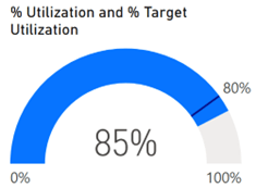
Figure 6.22 – Gauge visualization
Pam likes this new visual but also wants to investigate the Key Performance Indicator
(KPI) visual To experiment with the KPI visual, do the following:
- Click on a blank area of the canvas and add a KPI visual to the page.
-
Drag and drop the % Utilization measure from the Calculations table into the
Indicator field.
- Drag and drop the % Target Utilization measure into the Target goals field.
- Finally, drag and drop Year from the Calendar table into the Trend axis field.
The KPI visual will turn green and report that the displayed % Utilization is +5.99%
above the goal of 80%.
What-if parameters
Continuing with the example scenario we introduced in Chapter 2, Planning Projects with Power BI, Pam is pleased with her new visuals but is concerned that the % Target Utilization measure is a static number. Managers may wish to increase or decrease their target utilization in the future. Pam wants to provide a way for managers to easily adjust their target utilization goals. To this end, we can create a what-if parameter.
To create a what-if parameter, do the following:
-
Click on the Modeling tab of the ribbon and, in the What if section, choose
New Parameter. The What-if parameter dialog will be displayed, as shown in the following screenshot:
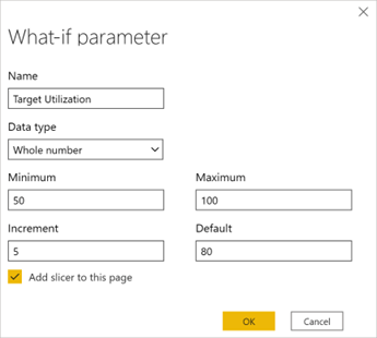
Figure 6.23 – What-if parameter dialog
- As shown in the preceding screenshot, set Name to Target Utilization, Data type to Whole number, Minimum to 50, Maximum to 100, Increment to 5, and Default to 80.
-
Leave Add slicer to this page checked and then click the OK button. A single
value slicer will be added to the page. This slicer includes a slider to adjust the value of the slicer.
- Adjust the slider so that it reads 80. Note that, in the Fields pane, a new table has been added called Target Utilization.
- Expanding this table shows that two entities are listed: a column called Target Utilization and a measure called Target Utilization Value.
-
Click on the Data view and then select the Target Utilization table in the Fields
pane. Row values exist for 50 through 100 in increments of 5.
-
Observe that this table is defined by the following DAX formula:
Target Utilization = GENERATESERIES(50, 100, 5)
GENERATESERIES is a DAX function that takes three parameters: a minimum value, a maximum value, and an increment. GENERATESERIES returns a table of all of the values between the minimum and the maximum in the specified increment.
- While in the Data view, expand the Target Utilization table and select the Target Utilization Value measure. Observe that the DAX formula for this measure is
as follows:
-

SELECTEDVALUE is a special DAX function that returns the currently selected value in a column specified as the first parameter. The second parameter specifies the value to return if no value is selected or if a single selection cannot be determined.
- Since our utilization is expressed as a decimal, modify this formula in the formula bar to read as follows:

- While the Target Utilization Value measure is selected, select the Measure tools tab of the ribbon, and click the % icon in the Formatting section. Also, set the number of decimal places to 0 if necessary.
- Switch back to the Report view and on Page 3, replace Target value for the gauge with the Target Utilization Value measure. Similarly, on the KPI visual, add the new Target Utilization Value measure to the Target goals field and remove the % Target Utilization measure.
- Now, slide the Target Utilization slider to 90. Note that we are now short of our goal on our gauge visualization and that our KPI visualization has turned red!
What-if parameters provide an easy and convenient mechanism for report viewers to interact with reports to set goals, control DAX calculations, and filter information on report pages.
Conditional formatting
In addition to the visual cues provided by the gauge and KPI visualizations, Power BI also supports visual cues in the form of conditional formatting. Conditional formatting can be used with tables and matrixes to provide background colors, font colors, and data bars for cells within the visualization. To see how this works, do the following:
- Select the Top Performers visualization.
- In the Values area of the Visualizations pane, right-click % Utilization, choose Conditional formatting, and then Background color. The conditional formatting dialog will be displayed.
Check the box for Diverging and the