Adding analytics to your visualization
We can add analytics to our visualization using the Analytics sub-pane in the
Visualizations pane:
- Ensure that your first visualization is selected in the canvas.
- Click on the Analytics sub-pane. Here again, we see several expandable sections.
- Expand the Average Line section and then click + Add. Note the dotted line that appears on your visual.
- Change the text Average Line 1 to Average Working Days. Underneath this, note that Measure is set to IsWorkDay.
- Below Measure, change Color to black and change Position to Behind.
-
Toggle on the Data label, change Color to black, change Text to Both, and finally, change Horizontal Position to Right.
Your visual should now look like the following screenshot:
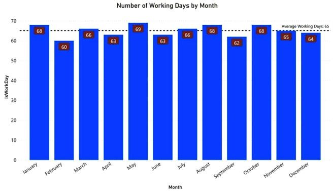
Figure 3.11 – Analytics added to Number of Working Days by Month visual
Your first visualization is now finished. Let’s move on to adding some additional visuals to the page.
Creating and using a slicer
Your first visualization is starting to look a little better! And now you also know that there is an average of 65 working days per month for all of the years 2017, 2018, and 2019 combined. But, let’s be honest, it’s a little weird having the number of working days
summed for each month spanning three different years. What you really would like to see is the number of working days per month for each year.
One method to accomplish this is to use the Small multiples feature. To see how small multiples work, do the following:
-
Ensure that your first visual is selected and change to the Fields sub-pane in the
Visualizations pane.
-
Drag the Year column from the Fields pane into the Small multiples field in the Visualizations pane. Your visualization is now divided into four quadrants with each year displayed individually, as shown in the following diagram:
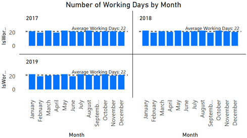
Figure 3.12 – Small multiples
However, instead of using Small multiples, we are going to instead use a slicer. Slicers are a type of visual in Power BI that are useful for providing user-selected filters that narrow the data in the data model that is presented within a report. Now, let’s see how they work:
- First, with your first visual selected, click on the X to the right of the Year column in the Small multiples field to remove the Year column from the visual. Your visual now displays a single Column chart, as before.
- Click on any empty portion of the canvas, on any place except your visual. This deselects the visual.
- Find the visualization icon in the Visualizations pane, which has a small funnel, as highlighted here:
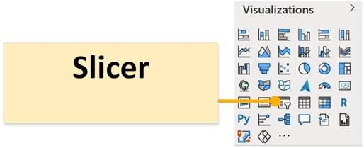
Figure 3.13 – Slicer visualization
- Hover your mouse over this icon and you will see Slicer displayed in a popup. Select this visual with your mouse and observe that a new, blank slicer visual is created that consumes the upper-left quadrant of the canvas. Power BI attempts to intelligently size new visuals based upon existing visuals on the canvas.
-
Drag and drop the Year column from your Fields pane into this new visual.
You should now have a list of years for 2017, 2018, and 2019 displayed in a vertical column with small boxes beside them. The word Year appears as the title of your visual.
-
Click on each year in the slicer in turn. Notice that your columns change heights. In addition, the y axis and data labels change as well as your average analytics line. What is going on? When you click on a year in a slicer, the slicer filters the column chart visual so that it is filtered to only rows in the data model for the selected year. Hence, your column chart goes from displaying all three years to just a single year. If you want to see two years, start by selecting a year. Then, hold down the Ctrl key and select another year. Now, both years are selected in the slicer and your column
chart also displays data for both of those years. As with all visuals, slicers can also be formatted. Let’s try formatting it.
-
Ensure that your new slicer is selected on the canvas and then click on the Format sub-pane of the Visualizations pane. There are some similar sections as before and some new sections as well.
- Expand the Selection controls area.
- Toggle the Show “Select all” option and notice that a new item is added to your slicer at the top that reads Select all. Selecting this option in the slicer selects all of the slicer options.
- Toggle on Single select. Notice that the other options go away, and your slicer selection controls change from boxes to radio buttons (circles). This slicer mode enforces single selection only within the slicer, such that holding down the Ctrl key no longer works for selecting multiple items within the slicer.
Let’s now do a final few edits to the format of our slicer:
- Under the Slicer header, change Text size to 16.
- Under Items, change Text size to 12.
- In the General section, change the Orientation field to Horizontal.
- Move and resize your slicer by using the middle-bottom sizing handle to shrink the visual until all three boxes appear in a single row. Your slicer should look like this:
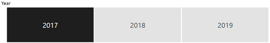
Figure 3.14 – Horizontal slicer
We now have two visuals on the page, but let’s create some more!
Creating more visualizations
Create some additional visualizations by following these instructions:
- Click a blank area on the canvas to ensure that no visuals are selected.
- Drag the Date column from the Fields pane onto a blank area of the canvas.
- Notice in the Visualizations pane that the Date column is displayed in the Values field with a hierarchy of Year, Quarter, Month, and Day. Four corresponding columns appear in the visual. Default settings in Power BI create an automatic hierarchy in the dataset for every column of the Date type. We will cover hierarchies in more detail later in this book. For now, switch the hierarchy to just the Date column by selecting the chevron next to the X to the right of the Date column in the Values field. Note that a checkbox appears to the left of Date Hierarchy. In this dropdown, choose Date instead, as shown in the following screenshot:
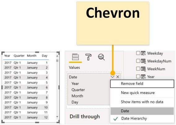
Figure 3.15 – Changing from Date Hierarchy to Date column
-
With the visual selected, switch the visual type to be Slicer by simply clicking the
Slicer icon in the Visualizations pane
- Hover your mouse over this visual and note that a tiny chevron icon appears in the upper-right corner of the visual:
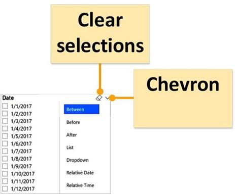
Figure 3.16 – Date slicer choices
- Click this chevron and observe that there are different modes for this slicer, Between, Before, Aft r, List, Dropdown, and Relative. For now, select Between. Oh, and do you see that other tiny icon just to the left of the tiny chevron? That’s supposed to be an eraser icon, otherwise known as Clear selections. It does what you probably surmised already; it clears all selections within the slicer.
- Move this slicer to the upper-right corner of the page.
-
Resize this slicer by first using the middle-left sizing handle to expand this slicer so that it consumes half of the page horizontally. Use the bottom-middle sizing handle to shrink the visual vertically until a red dotted line appears. This indicates that it is the same height as our first slicer.
Let’s create two additional visuals:
-
For the first visual, drag the Weekday column in the Fields pane onto a blank area of the canvas. Note that a single-column table of the distinct values for the days of the week appears.
- Drag the Date column from the Fields pane into this new visual. Four columns are automatically created for Year, Quarter, Month, and Day. As before, change this from Date Hierarchy to just Date.
- Change this visual to Clustered bar chart. That is the third visual over in the top row.
- In the Fields sub-pane within the Visualizations pane, drag and drop Date from the Legend field to the Values field. Note that the text changes to Count of Date.
- Drag the visual so that the top of the visual lines up with the top of our original column chart visual and then resize it so that this visual extends to the middle of the page horizontally and all of the way to the bottom of the page.
-
Notice that the weekdays are not in order. Use the ellipsis (…) in the visual to change
Sort by to Weekday and Sort ascending.
- Click on the Weekday column in the Fields pane and then, from the Column tools tab, choose the Sort by column and then WeekdayNum. This new visual now displays Monday at the top and Sunday at the bottom.
- Finally, format this visual to display Data labels.
- Click on a blank area of the canvas and select the Card visual. This is the visual in the fourth row from the top and farthest to the right.
- Drag Date from the Fields pane into this visual.
-
In the Fields sub-pane of the Visualizations pane, use the drop-down arrow next to
Earliest Date and change this to Count.
-
Lastly, reposition the Card visual to be in the center of the blank area of the canvas and resize the visual to be just big enough to fully display the Count of Date text.
Feel free to explore the Format and Analytics options for these new visuals. You will note that some visuals, such as slicers and card visuals, do not have any analytics available. When you are done, save your work by selecting File and then Save from the ribbon. Your canvas should look something like the following screenshot:
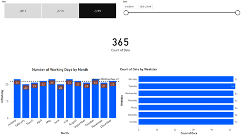
Figure 3.17 – Page of visuals
Now that we have multiple visuals on a page, let’s explore how these visuals interact with one another.
Editing visual interactions
As you have already seen, visuals on a page interact and modify the display of other visuals on a page. We can explore how these visuals interact with one another as well as how we can control visual interactions by doing the following:
- Start by making sure that 2019 is selected in the slicer in the upper-left corner of the page.
- Click on July in the column chart in the lower left-hand corner of the page. The July column becomes highlighted in our visual. Also notice that the card visual changes to display 31 and that the bar chart bars shrink to highlight just the number of weekdays in the month of July 2019. This behavior is called Highlight.
- Click on July again in the column chart to return the charts to their original state.
- Click on Monday in the bar chart. Again, Monday becomes highlighted, our card visual changes to 52, and our column chart changes to show the number of Mondays in each month of the year.
-
By default, this highlighting mechanism is not additive. For example, with Monday chosen in the bar graph, hover your mouse over the highlighted portion of July in the column chart. Observe that additional information is displayed in the tooltip. In addition to Month and the sum of IsWorkDay, Highlighted appears and reads
5. However, try clicking on the highlighted portion of the column chart. You might expect that our filters would now be Monday and these five days in July. Instead, the charts simply switch to only have July selected. However, we can make these filters additive.
6. With Monday selected in the bar chart, hover your mouse over July again, but, this time, hold down the Ctrl key and then click the July column. Note that the Card visual changes to read 5. By using the Ctrl key, we can make values selected within visuals additive with one another.
But what if you do not want your visuals to highlight or filter one another? Well, you can control that as well. If you have been paying attention, you may have noticed that the date slicer in the upper-right corner has not been changing when selecting elements of the other visuals. If you have been paying really close attention, you might also have noticed that, when you select a visual, the ribbon changes to display two additional tabs, Format and Data/Drill. Let’s explore the Format tab with respect to editing the interactions between visuals:
- Select the slicer in the upper-left corner.
- Click on the Format tab in the ribbon and then click on Edit interactions, which is the button on the far left-hand side. Notice that the Edit interactions button becomes shaded and small icons appear at the top or bottom of all of our other visuals:
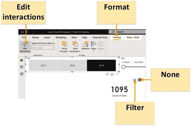
Figure 3.18 – Edit interactions
One icon looks like a column chart with a small funnel, and the other is a circle with a line through it. If you hover over these icons, you will see that the chart icon is called Filter and the circle icon is called None. The icon that is shaded in gray is the currently active interaction mode.
- Hover your mouse over the date slicer visual and then click on the Filter icon. The Filter icon becomes active and the None icon becomes inactive.
-
With the slicer visual in the upper-left corner still selected, hover over the Card
visual and select the None icon.
- Select the column chart visual in the lower-left corner and hover your mouse pointer over the bar chart. Notice that a third icon appears that is simply shaded in the column chart. This is the Highlight icon, which explains the behavior of this chart when we clicked on months within our column chart:
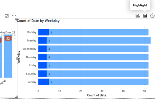
Figure 3.19 – Highlight interaction icon
- With the column chart still selected, hover over the Card visualization and choose the None filter icon.
- Repeat this same procedure for the bar chart visual in the lower-right corner so that the bar chart does not filter the Card visual. In addition, change the column chart to Filter instead of Highlight.
- Click on the Card visual and notice that all of the Filter, Highlight, and None icons disappear. This is because card visuals cannot filter other visuals.
- Click on the Format tab of the ribbon and now deselect Edit interactions by clicking on the button.
Let’s see what happens now as we click elements within our visualization:
- Click on 2017 in the horizontal slicer visual in the upper-right corner and notice that the date slicer changes to a range that only includes dates in 2017.
- Click back onto 2019 and the date slicer changes to only include dates in 2019. Notice that this entire time, the Card visual has continued to display 1095. This is because the slicer is no longer filtering the Card visual.
-
Move the date range in the date slicer. Notice that our horizontal slicer changes to only include 2019. Also notice that the Card visual changes numbers. This is because the date slicer is filtering the Card visual.
-
Click on a weekday in the bar chart visual. Notice that the column chart visual
no longer does highlighting but is filtered instead. Click on a month in the column chart visual to observe the different behavior between Filter and Highlight.
Once again, save your work using File and then Save from the ribbon.
Summary
In this chapter, we downloaded and installed Power BI Desktop. We then took a quick tour of the desktop application’s major user interface components, generated some working data to create a simple data model, and created some basic visualizations of that data model. We also learned how to format and add analytics to these visuals as well as how to control the way in which visuals interact with one another on a page.
In the next chapter, we will explore Power BI Desktop’s data ingest capabilities and add more data to our data model.
Questions
As an activity, try to answer the following questions on your own:
- What are the three different versions of Power BI Desktop?
- What are the nine major areas of the Power BI Desktop user interface?
- What are the three different views available in Power BI Desktop?
- What is DAX?
- What is DAX used for?
- What are the seven different panes that can be displayed in Power BI Desktop?
- What are the three sub-panes available in the Visualizations pane?
- What three types of interactions can there be between visuals?
Further reading
To learn more about the topics that were covered in this chapter, please take a look at the following references:
- Get Power BI Desktop: https://docs.microsoft.com/en-us/ power-bi/fundamentals/desktop-get-the-desktop
- Getting started with Power BI Desktop: https://docs.microsoft.com/ en-us/power-bi/desktop-getting-started
- Apply DAX basics in Power BI Desktop: https://docs.microsoft.com/ en-us/power-bi/desktop-quickstart-learn-dax-basics
- Add visualizations to a Power BI report (part 1): https://docs. microsoft.com/en-us/power-bi/visuals/power-bi-report-add-
visualizations-i - Add visualizations to a Power BI report (part 2): https://docs. microsoft.com/en-us/power-bi/visuals/power-bi-report-add-
visualizations-ii