Adding time
-
If you are working with time that extends the 24-hour format, it is important to change the format of your time entries to the Custom format. This way, you will ensure that all time is calculated correctly.
- For this example, continue with the TIME worksheet in the workbook named Date and Time.xlsx.
-
Notice in the following screenshot that in cells G2:G9, the total time is not being calculated correctly for cells that are the 24-hour format:
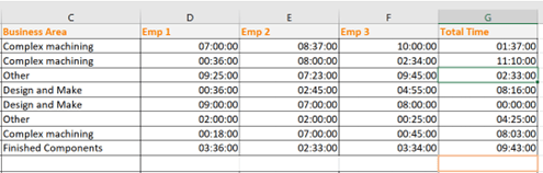
Figure 11.29 – TIME worksheet displaying incorrect SUM value
- To correct this, set the Custom format of the time in the Format Cells dialog box. Enter the following parameters in the Type: field: [h]: mm;@, as illustrated in the following screenshot. Click on the OK button to apply the format to the selected range:
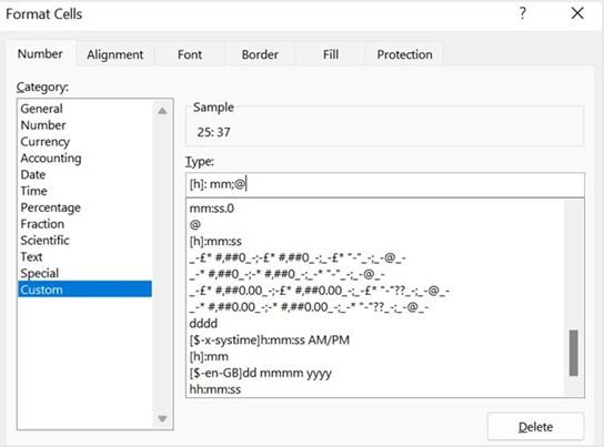
Figure 11.30 – Constructing a custom format to display time
- The format is updated to display positive values over the 24-hour format. If you wish the format to be the same for the rest of the time data, simply apply the same format, as illustrated in the following screenshot:
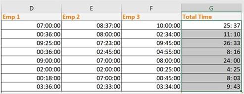
Figure 11.31 – Total time displayed using the [h]: mm;@ format
- There are existing time formats in the Custom category we can apply, if preferred, such as [h]:mm:ss for hours—this format is already included as part of the custom formats in Excel, or add specific formats, such as the following:
- [m]:ss for minutes (for example, 08:16 will be displayed as 496:00).
- [ss] for seconds (for example, 08:16 will be displayed as 29760).
- To sum the totals in cell G10, press the Alt + = keyboard keys, then press Enter to confirm and display the total in the cell.
-
If, for instance, Emp 2 worked overtime, we can add these additional hours to the existing time to calculate a final total. When the overtime is less than the 24-hour period, we can formulate the following function: =E4+TIME(F4,0,0). You can see an illustration of this in the following screenshot:
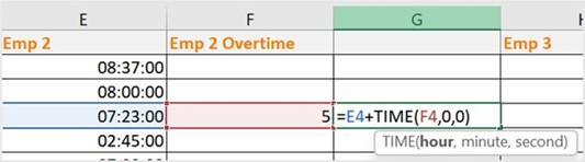
Figure 11.32 – Adding hours to time
- If the overtime is greater than a day in hours, we can construct the formula as follows by dividing the number of hours by 24: =E7+(F7/24). You can see an illustration of this in the following screenshot:

Figure 11.33 – Overtime

You should now have the skills to confidently work with time in Excel. In the next topic, we will recap PivotTables, as explained in our first-edition book, Learn Microsoft Office 2019, building on the foundation to learn more about PivotTables and any Excel 2021 enhancements.
Enhancing PivotTables
When creating a PivotTable, the data used to create the table remains as it is in the workbook—unchanged. A separate table is produced after creation where the data is manipulated to make it more understandable to the reader. There are a few things you should know before creating a PivotTable, in order to get the workbook data ready to get the most out of PivotTable reports.
The fi st point is that data needs to be organized vertically and contain column headings. The second point is to ensure that no blank rows are present in the data and that there are no additional descriptive notes or text in any of the cells or any additional formulas to the side or underneath the data. Another recommendation is that you format the data as a table before creating a table. The only reason for this is that any new data rows added to the table are included automatically in the range, adding them to the already defi ed dataset.
Let’s get our data ready to generate a PivotTable, as follows:
- Open the MattsWinery.xlsx workbook.
- On the first sheet, WINESALES, you will see data relating to wine sales, per quarter, region, label, and year. Before we create a PivotTable from this data, we will format the data as a table.
-
Click into the data on the worksheet, then go to Insert | Table, or use the Ctrl + T
quick key on the keyboard. The Format as a Table dialog box will be populated.
- Ensure that the range is correctly assumed in the Where is the data for your table? field.
- Check the box to indicate that you would like table headers to be included in the table, as illustrated in the following screenshot:
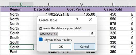
Figure 11.34 – Create Table dialog box
- Click on the OK button to format the selection as a table. Notice the Table Design tab at the end of the ribbon. Here, you can customize colors as well as name the table. We will call our table range WineSales. Enter this in the Table Name: field to the left of the ribbon, as illustrated in the following screenshot:
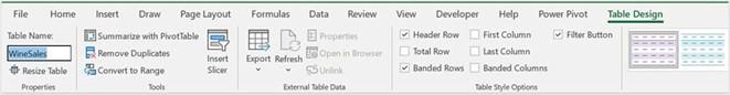
Figure 11.35 – Table Design tab displaying the Table Name: field
- To create a PivotTable, go to Insert | PivotTable.
-
A Create PivotTable dialog box pops up, where you can specify the data range and where you would like to place the PivotTable in the workbook. Excel automatically assumes you are using the table and refers to it in the Select a table or range option at the top of the dialog box. Note that you can also use an external connection here.
- We will choose to place the PivotTable on a new worksheet for this example.
- The last step is to decide whether to add this data to the data model so that you can analyze more than one table, as illustrated in the following screenshot:
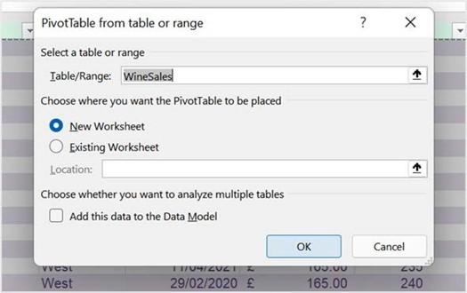
Figure 11.36 – Insert | PivotTable dialog box
-
Click on OK to confirm. A PivotTable is created on a new worksheet named Sheet1. Rename Sheet1 Profit and position it after the first sheet in the workbook.
If you are building a few reports or would like to bring a number of PivotTables together into a report dashboard, you could copy the Profit worksheet to create further worksheets on which to build your reports. Create another two worksheets by copying the Profit worksheet using the Ctrl + click + drag method so that we can build our different report dashboard views. You should now see the worksheets, as shown in the following screenshot:
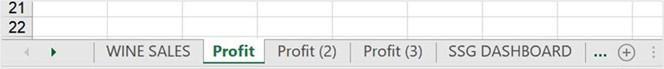
Figure 11.37 – Worksheets in the MattsWinery.xlsx workbook
- Let’s continue on to the next section by adding fields to build our PivotTables.
Adding PivotTable fields
In the previous section, you followed the steps to create a PivotTable from the worksheet data. Now, we will learn how to construct a PivotTable report by adding fields from the worksheet columns, as follows:
- Click to access the Profit worksheet. Be sure to have clicked on the PivotTable report so that the PivotTable Fields pane displays to the right of the window. This is where you add and customize field placements to produce a report.
- If you click on the Tools icon to the right of Choose fields to add to report, you will see various options to change the layout of the PivotTable Fields pane. Let’s change the view layout to Fields Section and Areas Section Side-by-Side, as illustrated in the following screenshot:
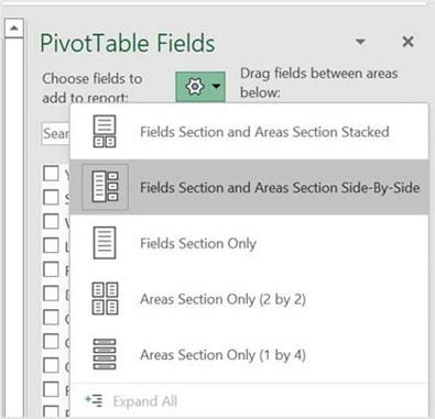
Figure 11.38 – PivotTable Fields pane
- Drag the field names from the left into the areas you require on the right. For this example, we will drag Region to Rows, Label will move to Columns, and Profit will move to Values, as illustrated in the following screenshot. Experiment with your table fields to see how you would like to present the data in the PivotTable report by simply dragging and dropping fields into the relevant areas:
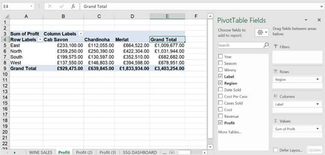
Figure 11.39 – PivotTable report and PivotTable Fields pane
- Before we make customizations to our PivotTable report, set the Report Layout option to display in tabular format. Click on Design | Report Layout | Show in Tabular Form, as illustrated in the following screenshot. The reason we may want to do this is that field names will display as heading labels:
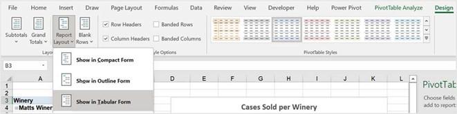
Figure 11.40 – Setting the Report Layout option to Show in Tabular Form
- We can now highlight the values on the PivotTable report and right-click to Show Values As, and then choose % of Grand Total.
- If you would like to sort your values, simply right-click in the Grand Total column and choose the Sort option. A submenu will be populated, where you can choose further options. Let’s choose Largest to Smallest. Note that all the values are now sorted from biggest to smallest in value.
- The second PivotTable report we will create will be to show cases sold by year and season. Remember you will need to click on the Profit (2) worksheet, then rename it Cases. Click into the PivotTable report, then drag the relevant fields into their position on the PivotTable Fields pane.
- Select the values on your PivotTable report, then apply the desired number format. We will use the Comma Style, and Remove Decimals, as illustrated in the following screenshot:
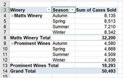
Figure 11.41 – Cases worksheet showing the populated PivotTable
-
Let’s create another PivotTable. Rename the Profit (3) worksheet Revenue. Add
Label (rows) and Revenue (values) to the PivotTable report.
- After adding the relevant fields, change the column heading to read Total Revenue.
We have now added the relevant PivotTable reports to each worksheet. In the next section, we will focus on creating PivotCharts and customizing the SSG dashboard.