Using the Gestalt principles when designing slides
It is important to understand how we receive visual input by visiting the Gestalt principles. Gestalt stands for shape or form.
The following are things to avoid when designing presentations:
- Using bullet lists
- Lots of text on slides
- Graphs that contain complex analysis
- Clipart, sounds, and animations that detract
Let’s look at some of the Gestalt principles. We have already learned about symmetry, the law of proximity, and the rule of thirds, which are all part of the Gestalt principles.
Figure and ground
This principle is where the figure is the focal point on a background on a slide. The mind will subconsciously determine what symbolizes the figure’s focus and what is in the background that the mind can ignore.
The foreground will capture the audience’s eye first:

Figure 8.27 – Figure and ground
Area
When overlapping large and dark areas contained on a slide, the mind will assume that the darker areas are larger:

Figure 8.28 – Area
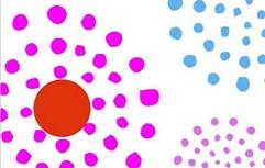
Similarity
This is how shapes, size, color, or orientation are perceived to be similar and are grouped by the brain when they are seen as connected. The principle is when you would use an object more than once on a slide to structure the experience of the audience, as follows:

Figure 8.29 – Similarity
Repetition of color
The brain navigates to the difference in color immediately and the shape that is formed because of the color change, although the objects are all the same:

Figure 8.30 – Repetition of color
Isomorphism
Isomorphism is where the audience perceives objects to either be visually connected or not visually connected:

Figure 8.31 – Isomorphism
Continuation
The continuation principle is where the eye follows the lines or curves on a slide. An example would be two shapes with an arrow between them showing the movement from point a to b:

Figure 8.32 – Continuation
Closure
The brain fills in any missing information on a slide by routinely skipping over any gaps and viewing the slide as a whole:

Figure 8.33 – Closure
Proximity
When elements are positioned close together, they appear connected as a group:

Figure 8.34 – Proximity
Synchrony
Here, elements that are moving in the same direction together appear connected or related:

Figure 8.35 – Synchrony
Common region
This is perceived as a group by the audience when the element is surrounded by a border:

Figure 8.36 – Common region
Simplicity
Complex elements are perceived as one unless they are defined by color:

Figure 8.37 – Simplicity
Focal point
This principle holds the audience’s attention by emphasis, similar to the rule of thirds.
These principles will help you create a professional, engaging presentation. Be sure to consider these when designing content for your slides – working through this list will prompt thought and application ideas for your content:

Figure 8.38 – Focal point
Summary
This chapter has imparted plentiful design skills to aid your presentation transformations and create engaging content. You should now have theoretical knowledge since you have been taught about everything you should consider when designing, such as the principles of design and the importance of presentation and design skills. We have identified tools to aid and enhance presentation design and tackled the important subject of presentation planning. You learned how to deliver clear messages to persuade audience participation, as well as how the brain tackles visual elements. In addition, you understood how sound and images impact a presentation and learned about the brain and color psychology. We ended this chapter with some useful color wheel tools and the theory behind the Gestalt principles to aid with slide design
In the next chapter, you will be taken on a journey through the essential updates and new features of Excel 2021. You will learn all about the Advanced Filter feature and the new FILTER function, as well as learn more about conditional formatting rules. We will focus on cleaning data and learning how to import, clean, join, and separate data while learning about some new features along the way, such as the UNIQUE function. We will also look at common challenges when working with Office 2021 applications as a whole and how to troubleshoot the stumbling blocks.


