Law of proximity
The visual cortex in the brain processes visual images and is the largest system near the rear of your brain. Hoaxing the mind visually by using the law of proximity is another way to ensure that any elements that are placed on a slide near each other are connected in some way. The retina is a thin tissue located around the back inside layer of the eye. After visual input is received by the retina, it is passed to the brain, which then processes the information in terms of shape, color, and orientation:
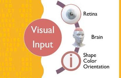
Figure 8.15 – Law of proximity
Now that you have learned about the law of proximity, let’s learn how images and sound impact engagement.
Investigating the impact of images and sound
As we mentioned previously, visual impact is key when designing presentations. Always use high-resolution photographs and try to avoid stickers and emoji-type images. It is especially important to mention that having a sticker or emoji image on one slide and then a high-resolution photograph on the next will interrupt the presentation’s flow, so consistency cannot be achieved by mixing the two types of visual aids. An audience will respond positively to content-appropriate, high-resolution images that have been placed on a background that makes good use of white space.
It’s worth mentioning that you should always Compress Pictures before sending out a presentation to an audience. Use the Delete cropped areas of pictures option to get rid of any previously cropped-out areas of images within your slide presentations. This will reduce the presentation’s size considerably. Click on an image in the presentation, then go to Picture Format | Compress Pictures to navigate the options:
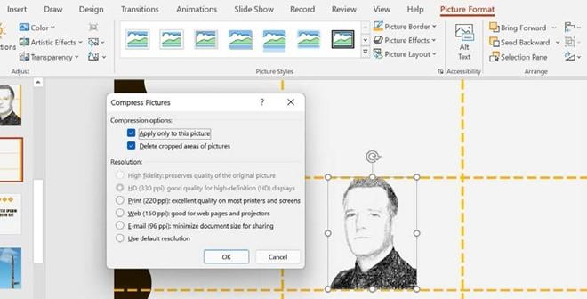
Figure 8.16 – Compress Pictures
Now, let’s discuss sound. Recording yourself presenting is always a daunting task. Often, you do not like the way your voice sounds, or you find that you repeatedly say “um,
ok, so…,” or your tone is monotonous. Don’t worry about this, though – everyone is unique and voice pitch and tone vary greatly. You can always fix this with a voiceover, either downloaded or by using a colleague. The new and existing features in Office 2021, Rehearse with Coach and Presenter Coach, allow you to check sound, movement, speech, and so much more. We learned about these amazing features in the PowerPoint chapters of this book.
Sound can change the mood of the audience quickly and needs to be considered necessary, especially when using animations and transitions. Ask yourself the following questions before adding sound to a presentation:
- Is there a piece of music that would help set the mood and tone of my presentation? Would it contribute to me winning the audience over with a particular piece of music that’s relevant to my topic?
- How will adding sound to this particular presentation captivate the audience?
- What about the age, gender, and nature of the presentation concerning sound?
- If I add music to my presentation, how would I keep the brand and content connected?
These are just some of the points to run through when deciding to add sound to your presentation – remember, less is more!
Applying guides to slides
In a previous section, we discussed the theory around white space and the rule of thirds. To physically use the rule of thirds principle on a presentation slide, you must carry out some steps.
The first step is to split your presentation slide, using horizontal and vertical guides, into three equal parts. Follow these steps:
- Open a new presentation and insert a new blank slide.
- Click on View | Guides, after which guidelines will appear on the slide.
- To insert your own vertical and horizontal guides, right-click on one of the existing guidelines, then select Add Horizontal Guide or Add Vertical Guide from the shortcut menu provided:
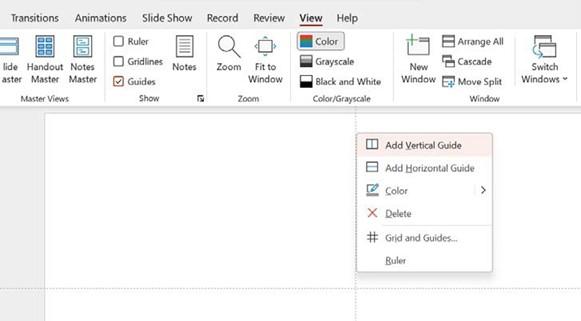
Figure 8.17 – Adding guides to slides
Drag the guides to a position on the slide so that the slide is split into two equal horizontal and two equal vertical parts.
Now, use the grid to align your presentation content so that you can optimize the visual experience for your audience. You can stimulate an audience’s response by using the rule of thirds to increase curiosity, or create tension, to name a few examples. See the slide examples in the White space and the rule of thirds section.
When referring to the images, the first image displays that the rule of thirds has not been met, while the second displays an example of the rule of thirds. Adding a photograph with the eyes of the person in the upper horizontal third of a slide will make a huge difference, and so will adding an image to the right or left of the vertical rule of thirds – never place an image or object in the center of a slide. Not only is this an important principle when designing slides, but something you can take into consideration when taking photographs with your mobile phone or camera going forward.
Now, let’s learn how to align and group objects.